The Art of Picking the Right Color Scheme for Your Cosmetics Packaging Boxes
2025-12-31 20:21:45.jpg)
The Art of Picking the Right Color Scheme for Your Cosmetics Packaging Boxes
Choosing the right color scheme for cosmetics packaging boxes is an art that combines creativity, psychology, and branding. At Hola Custom Boxes, we've helped numerous clients craft packaging that not only protects the product but also speaks volumes about their brand identity. In this article, we’ll walk you through the key elements of selecting the perfect color palette to make your product shine on the shelf.
From brand recognition to customer engagement, the colors on your packaging do more than decorate—they communicate. A carefully selected palette can set the tone for your brand, influence buying decisions, and create a lasting impression on your target audience.
With a structured approach, you can confidently create packaging that captures attention and aligns with your brand's voice. Let’s explore how to make color work for your cosmetic products.
.jpg "product")
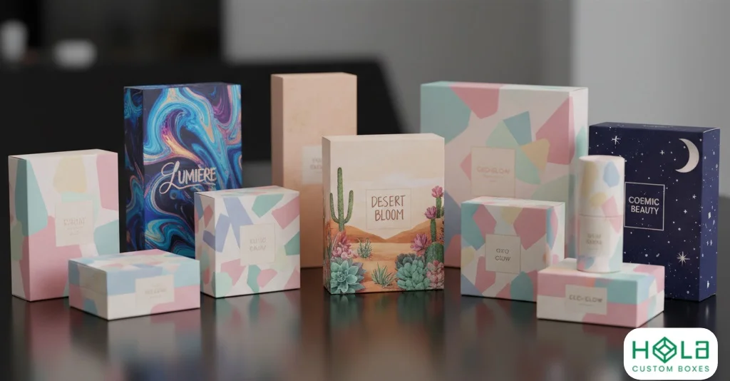
Importance of Color Scheme in Cosmetics Packaging
Color plays a decisive role in the success of cosmetic packaging. The design must grab attention, evoke emotion, and reflect the brand’s values—all within a few seconds of a customer glancing at the shelf.
Color helps customers form an immediate perception of your product. Warm colors like pinks, peaches, and golds often symbolize softness, elegance, or femininity—ideal for skincare and beauty products. On the other hand, bold colors like black, red, or metallics can evoke luxury, drama, and exclusivity.
To select the right scheme, consider your brand’s identity, your ideal customer, and what kind of experience you want to create. For instance, a natural skincare brand might lean towards earth tones like green, beige, or white to emphasize purity and sustainability.
Coordinate tones perfectly across Cosmetic Packaging Boxes.
Every visual element—from the box background to logo accents—should work together harmoniously. Experiment with shades, test combinations, and align your packaging colors with your marketing strategy. The goal is to ensure your cosmetic box not only looks good but also tells your brand story at a glance.
Consider Your Audience
The importance of color schemes in cosmetics packaging must be balanced - selecting the right colors for your intended audience is essential. With this in mind, consider who you're targeting when designing your packaging. Consider their preferences and the age group they belong to. Here are some tips on how to pick a suitable color palette:
- Research current trends within the target demographic. Look at what other brands within the industry are doing and build from that.
- Consider any existing brand identity or logo design elements you may have, as these will need to be reflected through the chosen colors.
- Explore different shades and tints of specific colors until you find one that complements your vision.
- Be mindful of cultural interpretations; different countries may perceive certain hues differently, so consider this before making a final decision.
Choosing a color combination that resonates well with your desired customer base is essential. It stands out from competing products but conveys an appropriate quality and product-type message. That way, you'll ensure maximum appeal and attract more potential buyers!
Highlight hero SKUs in Custom Lipstick Packaging Boxes and Custom Serum Boxes.
How Color Psychology Can Influence Buying Decisions
When designing cosmetics packaging, color can be the make or break factor. Color psychology plays a pivotal role in influencing buying decisions. It's not just about which colors look good together; there must also be an understanding of how consumers perceive these colors and the emotions they evoke when viewing cosmetic products.
We know that certain hues are associated with certain feelings – for example, blue is often seen as calming, while red is often seen as strong. When selecting the right color scheme for your cosmetics packaging boxes, consider the message you want to convey and assess potential cultural implications; different countries have their own values and perceptions of color symbolism. By taking time to research this aspect of design, you'll be better equipped to choose a palette that effectively communicates your brand identity and resonates with customers on an emotional level.
Keep your eco ethos visible through Eco-Friendly Boxes.
Choosing Colors Related To Your Brand
When it comes to cosmetic packaging, the color scheme you choose is an essential factor in making your product stand out. Selecting a color that reflects your unique brand identity and personality will help communicate what sets your products apart from competitors. Choosing the right palette of colors can be tricky, but there are specific steps you can take to ensure success.
First, consider how each color within the palette interacts with one another. When selecting shades that align with your branding, mix warm tones like reds and oranges with cooler hues like blues or greens for a balanced look. The contrast between these two ranges creates a visually appealing combination while emphasizing both elements' features. Additionally, using lighter tints and darker shades together gives depth and dimension to the design.
The next step is to decide on a focal point for your cosmetics packaging boxes – this could be an image, logo, or text element accented by at least one brighter shade to draw attention. This helps create a bold statement piece that stands out - make sure not to overdo it! By keeping all other colors neutral or muted, you'll achieve maximum impact without overwhelming viewers. In summary, choosing complementary colors that reflect your branding is essential for creating eye-catching cosmetic packaging designs that capture consumers' attention.
Build unforgettable color-driven branding with Hola Custom Boxes.
Consideration Of The Product Color
Choosing the right color scheme for your cosmetics packaging boxes is like assembling a delicate puzzle – each piece must match ideally to create an eye-catching masterpiece. As a cosmetic packaging design expert, Hola Custom Boxes always consider the product color when deciding on a hue selection. Not only should it complement the brand's existing palette and logo, but it should also reflect what's actually inside the box. For instance, if you're selling lipsticks or eyeshadows in bright shades like fuchsia or purple, choose colors that draw attention to those vibrant hues. Similarly, muted tones are best suited for foundations and concealers, while pastel pinks and peaches work well for blush palettes. By taking the specific cosmetic hue of your product into account before making any decisions about color schemes, you can ensure that your boxes stand out from competitors!
Striking A Balance Between Minimalism And Information Overload
When choosing a suitable color scheme for your cosmetic packaging boxes, striking an effective balance between minimalism and information overload is key. Too much clutter and too many colors can be visually overwhelming and may not effectively communicate the desired message. On the other hand, a minimalist design without any colors may look dull and uninviting, leading customers to miss crucial product details that must be highlighted.
The best approach is to keep things simple but stylish, using two or three complementary colors. This will allow you to achieve a cohesive visual identity while clearly conveying what's inside each box. For instance, if you want to draw attention to the brand name, choose one eye-catching hue, like bright red, against a neutral background like white or black. Similarly, use different shades of blue for skincare products or green hues for organic items, so customers instantly recognize them at first glance.
Emphasis On Font, Images, And Visuals In Cosmetics Packaging
After striking a balance between minimalism and information overload, it's time to focus on the cosmetics packaging's font, images, and visuals. To truly stand out from competitors, these elements must be treated with care for the design to be eye-catching yet professional. Focusing on fonts is key to creating effective cosmetic packaging. The proper font selection conveys the brand persona while remaining legible enough so customers know exactly what they are buying. It's essential to pay attention to how much emphasis you place on your font; too little or too much could lead to lackluster results.
Just as essential as font selection is choosing the correct pictures and visuals. For example, abstract shapes or symbols work better than overly detailed photographs because they capture attention without seeming overwhelming or cluttered. Additionally, ensuring that your visuals have high resolution will provide clarity for viewers - something all cosmetic brands should strive for! All this considered, carefully experiment with different components, as no two designs are alike.
Incorporating Feedback From Customers And Stakeholders
When designing cosmetic packaging boxes, paying attention to customer feedback and stakeholder input is essential. Customers want a product that looks attractive, professional, and easy to identify with the brand. Stakeholders care about how their products are represented in the marketplace. They may have specific standards for aesthetics or branding that need to be taken into account.
It's also important to consider industry trends. Are there any popular color schemes being used? Do customers prefer specific colors over others? Listening to customer and stakeholder opinions can help you create a design that meets everyone's expectations while remaining true to your brand identity. Selecting the right color scheme for your cosmetics packaging boxes will help them stand out from competitors and engage consumers more effectively.
Conclusion
The color scheme is an essential factor when creating the perfect cosmetics packaging design. There's no one-size-fits-all solution when choosing the right colors; each product and brand will require its unique palette. It's important to consider your target audience, how color psychology may influence their purchasing decisions, select hues that align with your brand identity, and ensure the overall package stands out from the competition. Moreover, don't forget about other elements, such as font selection and visuals – these are crucial for ensuring customers understand what they're buying. Finally, get feedback from stakeholders and customers alike – this could be invaluable for refining your designs until they look perfect!