The Rise of Minimalist Cosmetic Packaging: A Passing Trend or the Future?
2026-03-01 16:00:51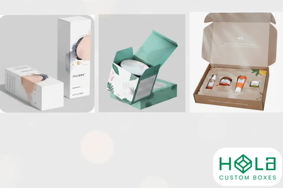
The Rise of Minimalist Cosmetic Packaging: A Passing Trend or the Future?
Minimalism has swept through beauty branding—from sleek, uncoated cartons to unembellished typography and calming neutrals. But is minimalist cosmetic packaging just another aesthetic cycle, or is it the future of sustainable, luxury beauty packaging design? In this guide, we’ll unpack the strategic reasons behind minimalism, where it excels (and where it doesn’t), and how brands can apply it without sacrificing shelf impact or compliance.
At Hola Custom Boxes, we help beauty brands translate strategy into packaging—from eco-friendly kraft cartons to premium rigid boxes—so your minimalism looks intentional, not invisible. Explore structures, finishes, and materials tailored to cosmetics in our Cosmetic Boxes collection.
Why Minimalist Cosmetic Packaging Is Rising Now
1) Sustainability is table stakes
Minimalism naturally reduces inks, foils, and excess materials. Paired with recyclable boards, water- or soy-based inks, and plastic-free coatings, it’s easier for brands to align with eco targets without overcomplicating specs. Fewer components can also streamline LCA (life-cycle analysis) and end-of-life sorting for consumers.
2) Luxury has shifted from “loud” to “quiet”
Quiet luxury favors restraint over maximal bling. Think soft-touch lamination, micro-embossed logos, and tone-on-tone spot UV rather than splashy graphics. For prestige skincare and fragrance, minimalism communicates confidence and craftsmanship.
3) Clarity converts online
In e-commerce thumbnails and on mobile PDPs, cluttered graphics blur together. Clean layouts, high legibility, and focused hierarchy make claims and shade names readable at small sizes, boosting click-through and reducing returns.
4) Cost efficiency under inflation
Minimalism can reduce plates, passes, and finishing operations—lowering unit costs for growing brands. Even when you choose premium stock or soft-touch coatings, a pared-back print plan often offsets those upgrades.
Minimalist Cosmetic Packaging: Benefits & Trade-Offs
Pros
Brand clarity & recognition: Restrained systems (limits on colors, grid usage, and whitespace) create memorability.
Sustainability alignment: Fewer decorative layers = easier recyclability and lower material inputs.
Premium perception: Understated detail (e.g., blind emboss, linen board) reads artisanal and luxe.
Operational simplicity: Fewer SKUs for inks/foils; smoother reprints and color consistency.
Cons
Risk of “too plain”: Minimal isn’t synonymous with bland. Without tactile or structural interest, cartons can look generic.
Retail differentiation: On a loud shelf, a quiet box can disappear unless structure, texture, or form factor stands out.
Information density: Cosmetics require INCI lists, warnings, batch/lot codes—you’ll need sharp typography and hierarchy to keep everything readable within a minimal layout.
Materials & Finishes That Make Minimalism Feel Premium
Minimal design thrives on tactility. Instead of relying on heavy graphics, elevate the feel:
Stock choices: Uncoated premium boards, dyed-through black boards, kraft for natural positioning, or cotton/linen textures for skincare.
Low-ink printing: One or two spot colors with excellent registration; consider tone-on-tone (same color, different sheen via spot UV).
Subtle dimension: Blind emboss/deboss, micro-textures, or registered soft-touch contrasting with a matte board.
Selective metal: Slim foil accents (micro-lines or monoline wordmarks) conserve foil while signaling luxury.
Plastic-free windows: If visibility is needed, consider cellulose-based windows or thoughtful die-cuts shaped to the brand mark.
Need structural suggestions for your product type? Browse formats in Cosmetic Boxes—from tuck-ends and sleeves to two-piece rigid and drawer styles.
Structural Choices That Support a Minimal Look
Rigid two-piece or drawer boxes: Ideal for premium skincare sets, fragrances, and hero SKUs—your “quiet” exterior is balanced by precision fit and weight in hand.
Sleeve + tray: A printable sleeve provides branding while an unprinted tray keeps material usage low and recyclable.
Auto-lock or crash-bottom cartons: Fast assembly for high-volume color cosmetics; use edge printing or spine foil as subtle brand signatures.
Inserts: Molded pulp or paperboard inserts replace plastic vac-forms and keep components secure—maintaining the minimal ethos end-to-end.
Minimalism in a Regulated Category: Typography & Information Design
Cosmetic packaging must carry INCI, net weight/volume, usage, warnings, and country-specific labeling. Minimalism excels when you:
Build a clear typographic scale (headline → claim → INCI → regulatory).
Use high-contrast, readable fonts (avoid ultra-thin weights for 6–8 pt legal copy).
Separate copy blocks with generous line spacing and whitespace rather than rules or ornaments.
Design a modular back panel that scales across SKUs and regions without redesigning the whole layout.
When Minimalist Cosmetic Packaging Performs Best
Skincare & treatment lines positioned as clinical, clean, or science-backed.
Refillable programs or sustainability-led brands where material honesty matters.
Direct-to-consumer brands optimizing for thumbnails, social, and UGC photography.
Giftable sets where structure and unboxing do the talking (rigid boxes with soft-touch, magnetic closure, and blind debossed logo).
When to Dial Up (Just a Little)
Minimal doesn’t mean monotone. If your shelf is noisy, introduce one of the following without abandoning restraint:
A single signature color (build a system around hues per regimen: cleanse = cool gray, treat = bone, moisturize = warm white).
One premium highlight (e.g., a 1 mm gold foil keyline around the panel or a micro-foil monogram).
Distinctive die-cut window or corner radius as a proprietary brand geometry.
Texture contrast (matte base + spot UV on the logotype only).
Sustainability: Making “Less” Mean More
Minimalism is the perfect framework to implement sustainable cosmetic packaging credibly:
Right-weighting: Engineer the board caliper to the product (avoid over-spec).
Mono-material bias: Paper/paperboard constructions simplify recycling; minimize mixed components.
Ink discipline: Limit heavy floods; opt for low-VOC, water-based coatings.
Refills & modularity: Design cartons that accept refills or can be reused as storage—tell that story clearly on pack.
Cost & Operations: Where Minimalism Pays Off
Shorter make-readies and fewer print passes reduce waste and time.
Color discipline reduces risk in reorders (less variance across lots).
Systemized dielines mean faster SKU expansion—swap shade names/claims without redesigning.
When you’re ready to scale, Hola Custom Boxes can standardize your dielines and finishing libraries so new SKUs flow through production smoothly.
Practical Playbook: Launching a Minimal Cosmetic System
Audit what info must be on the master panel vs. secondary panels.
Pick a hero substrate (e.g., warm white uncoated or natural kraft) and lock a two-finish rule (soft-touch + spot UV, or blind deboss + foil).
Define color rules (max 1–2 inks + optional micro-foil).
Choose 1–2 structures that scale (tuck-end for singles, rigid drawer for kits).
Prototype tactility—your print files won’t show feel; order dummies to confirm.
Document a spec sheet: board, caliper, coatings, finishes, tolerances, QC steps.
Roll out with hero SKUs first; expand once photography and PDPs are dialed.
FAQs: Minimalist Cosmetic Packaging
Q1: Will minimalism hurt shelf visibility?
Not if you balance it with structure, texture, and hierarchy. A calm box can still command attention with tactile cues and confident typography.
Q2: Can minimal packaging still feel luxurious?
Absolutely. Soft-touch, blind emboss, linen boards, micro-foil—all signal luxury without visual noise.
Q3: Is minimalist packaging cheaper?
It often reduces ink/finish steps, but premium stocks or special textures can add cost. Net savings depend on the exact spec.
Q4: How do I keep regulatory copy readable in a minimal layout?
Use high-contrast type, disciplined grids, and adequate line height. Consider a modular back panel shared across SKUs.
Q5: What’s the best starter spec for a clean, eco-forward look?
Try uncoated FSC kraft or warm-white board, 1–2 spot inks, water-based coating, and a blind-debossed logo. Add a paperboard insert to remove plastic.
Conclusion: Trend or the Future?
Minimalist cosmetic packaging isn’t a fad—it’s a strategic response to sustainability, luxury’s shift to subtlety, and the realities of e-commerce. When executed with tactile quality, careful hierarchy, and structural thought, minimalism builds brand trust and reduces waste—making it a powerful long-term platform.
Ready to design a minimalist system that still sells on the shelf? Partner with Hola Custom Boxes and explore format options in Cosmetic Boxes. We’ll help you specify the right materials, structure, and finishes—so your “less” truly becomes more.