How Packaging Affects Buying Decisions in Today’s Market
2026-03-01 16:43:15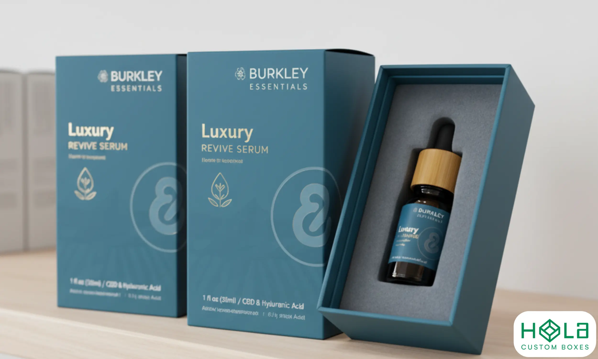
How Packaging Affects Buying Decisions in Today’s Market
Great packaging is more than a wrapper—it’s a decision engine. In a split second, color, typography, materials, and sustainability cues shape how shoppers judge quality, trust, and value. When your on-shelf look aligns with online visuals and the unboxing feels intentional, perceived risk drops and conversion rises.
At Hola Custom Boxes (Dallas, USA), we design brand-right packaging that blends premium finishes with sustainable choices—so your box tells the right story everywhere it appears.
Color & Typography Psychology: Fast Signals That Nudge Choice
Color and type make the first impression—and often the final one.
Color sets mood and tier. Deep, desaturated hues and restrained palettes cue premium; bright contrasts drive energy and approachability.
Contrast boosts legibility. High contrast (type vs. background) cuts search time on shelf and online.
Typography carries voice. High-contrast serifs communicate heritage and luxury; geometric sans serifs read clean, modern, and tech-forward.
Pro tip: Define brand color tolerances (ΔE) and typographic scales across packaging and web so your PDP images match the physical carton—minimizing cognitive dissonance at pickup.
Explore luxury structures and finishes: Custom Printed Rigid Boxes & Packaging
Materials & Sustainability Signals: Trust At a Glance
Shoppers scan for recyclability, recycled content, FSC/PEFC logos, and minimal overpackaging. These icons and textures act as credibility badges—when they look authentic and are placed clearly, they accelerate decisions.
| Signal | What it communicates | Why it matters |
|---|---|---|
| Recycled content | Circularity & waste reduction | Aligns with values; supports premium at parity pricing |
| FSC®/PEFC | Responsible fiber sourcing | Adds trust, especially in beauty & food |
| Minimal packaging | Lower footprint & honesty | Suggests efficiency and value, not corner-cutting |
Avoid greenwash. Keep claims verifiable and specific (e.g., “Box: 85% post-consumer fiber; Wrap: FSC®-certified paper”).
Browse eco-forward presentation formats for retail: Display Packaging
Storytelling on the Box: From Purpose to Purchase
Packaging is a chapter of your brand narrative—not a billboard for features. Use hierarchy to guide attention:
Why it matters (benefit headline)
What it is (plain-English product name)
Proof (one or two credible claims—certifications, performance metric)
Next step (QR to how-to, care, or refill program)
Minimalist clarity signals confidence; bold elements signal energy. Don’t crowd the story—give typography and negative space room to work.
Beauty and skincare lines benefit from structural storytelling: Cosmetic Boxes
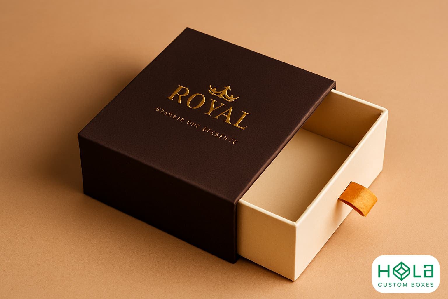
Shaping Perceived Value: Tactility, Fit, and Finish
Perceived quality often rides on touch and tolerance:
Soft-touch, linen, or velvet wraps add sensory memory and premium cues.
Tight calipers & square edges prevent lid wobble and panel bowing.
Emboss/deboss + selective foil create focal points without visual noise.
Right-sized interiors & inserts reduce rattle and damage (and returns).
When the box opens intuitively and parts align, shoppers infer product reliability—boosting willingness to pay and repeat purchase intent.
Bridging Online and In-Store: One Promise, Many Touchpoints
Your packaging should match the promise made on PDPs, ads, and UGC:
Photograph true color & finishes (matte vs. gloss) so the physical box meets expectations.
Maintain label hierarchy (benefit → product → proof) across thumbnails, hero images, and cartons.
Design unboxing for the camera. Contrasting interiors, layered reveals, and clean copy drive shareable moments without extra inserts.
Rule of alignment: If your online voice promises simplicity, the box should open in under 10 seconds without a manual.
Labels, Icons & Compliance: Clarity Reduces Friction
Readable icons, compliant barcodes, and accurate claims reduce perceived risk:
Place UPC/GTIN with adequate quiet zones and contrast for quick scans.
Keep recycling & material icons legible at small sizes (check minimums).
Use precise language—avoid fuzzy claims like “eco” or “green” without a standard.
Clear labels help customers finish the decision confidently—and lower customer service load post-purchase.
Unboxing as Proof: Sensory Cues That Validate Price
Unboxing translates anticipation into proof of value:
Sound: The soft “thud” of rigid board, the clean “click” of magnets.
Texture: Fabric pulls, textured liners, and soft-touch wraps.
Timing: A deliberate reveal that gets to the hero quickly.
Design for reusability (keepsake structures) to extend your brand’s life on the dresser or desk—free impressions, every day.
Frequently Asked Questions
Do cultural differences change packaging choices?
Yes. Calibrate colors, symbols, and copy based on local meanings, usage norms, and regulations. Validate with regional testing before scale.
Does price influence color strategy?
Often. Premium tiers trend toward restrained palettes and rich contrasts; value tiers use brighter hues and larger benefit type for quick scanning.
Can packaging drive impulse purchases?
Absolutely—through bold contrast, clean benefit statements, tactile cues, and end-cap visibility. Limiting “choice load” on front panels helps.
How do return policies relate to packaging trust?
Sturdy structures and clear instructions signal reliability pre-purchase; easy returns reinforce that promise, lowering perceived risk.
Do certifications change perception?
Yes—recognized marks (FSC/PEFC, compostability, food-contact where relevant) increase credibility and justify premium positioning.
Why Brands Choose Hola Custom Boxes
Premium finishes at scale: soft-touch, foil, emboss/deboss, magnetic closures.
Eco options without compromise: FSC® wraps, recycled boards, minimal inks.
Tight tolerances & color control: G7/ISO workflows and drawdowns for accuracy.
Agile MOQs & fast lead times: startup-friendly, enterprise-ready, USA-based support.
Ready to turn packaging into your fastest conversion lever?
Start here: Hola Custom Boxes or request concepts for Custom Printed Rigid Boxes & Packaging.