Graphic Design Tips for Ammo Packaging: Caliber Visibility, Icons, Panels & Layouts
2026-01-27 12:30:47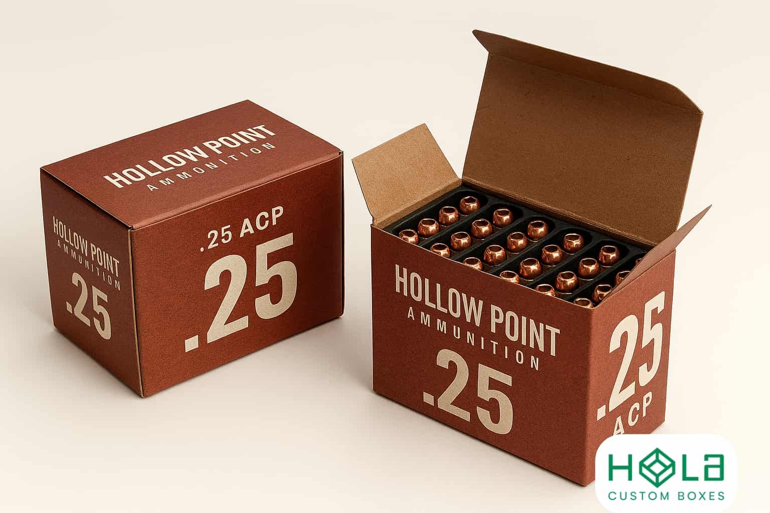
Graphic Design Tips for Ammo Packaging: Caliber Visibility, Icons, Panels & Layouts
You can’t afford to hide the caliber on an ammo box, because that’s what shoppers scan first. Put it in bold type, high contrast, and the same spot on every SKU, then support it with a clean front panel that also shows bullet type, weight, and quantity in a clear size order. Add a few simple icons for load and safety, but don’t clutter. The real advantage comes when every panel works together…
Main Points
- Make caliber the largest, highest-contrast element, locked to a consistent position across SKUs for quick shelf scanning.
- Prioritize front-panel essentials: caliber, bullet type/weight (FMJ/JHP/SP + grains/grams), and rounds-per-box; move warnings and barcodes off the front.
- Build a clear hierarchy using size and alignment: caliber first, load name second, then supporting details, with clean edges and generous top breathing room.
- Use a tight icon set for bullet types and a single primary use case; pair each icon with a 2–3-letter label to avoid misreads.
- Standardize a packaging system with shared grid, type scale, and color logic by caliber families; test readability under retail lighting and matte/gloss finishes.
Make the Ammo Caliber Readable First
The caliber is the headline of your ammo packaging, so make it the first thing your customer can read at a glance. Set it in a bold, clean typeface with generous letterspacing and high contrast against the background.
Choose numerals that don’t blur (avoid ultra-thin strokes or condensed cuts), and print large enough to stay legible at arm’s length and under fluorescent retail lighting.
Lock the caliber into a consistent position across SKUs so shoppers can scan fast without relearning your layout. Don’t let patterns, photos, or gradients intersect the characters; give the text a quiet field or solid badge.
If you add outlines or shadows, keep them subtle and crisp. Test readability on matte and glossy stocks before you commit.
Prioritize Front-Panel Essentials (What Goes Upfront)
Three details should dominate your front panel: caliber, bullet type/weight, and quantity. Put them on the primary display face so a buyer can confirm fit, purpose, and count in one glance.
Spell out bullet type (FMJ, JHP, soft point) and pair it with grains or grams; don’t force people to decode abbreviations without context. State quantity as rounds per box, not just “50,” and keep it tied to the unit.
Add one or two use-case cues only if they’re factual, like “range” or “hunting,” and avoid broad performance claims. Include brand and line name, but keep them secondary to the purchase-critical info.
Reserve legal text, warnings, and barcodes for other panels.
Set a Front-Panel Hierarchy (Big to Small)
Once you’ve decided what belongs on the front panel, control how quickly it reads by scaling the information from largest to smallest. Lead with caliber as the dominant element, then place load name or product line beneath it, and follow with key specs in a smaller, steady rhythm.
Keep type weights consistent so size—not random styling—drives priority. Use alignment to reinforce hierarchy: stack related items, keep left edges clean, and limit competing focal points.
Give the top two elements breathing room; tighten spacing as information gets less critical. Maintain contrast for legibility, but reserve the boldest contrast for the first read. If you include a brand mark, size it to support trust without stealing attention.
Test at arm’s length and at shelf distance.
Use Icons for Load, Use-Case, and Safety
Because ammo boxes get scanned in seconds, icons let you communicate load type, intended use-case, and core safety notes faster than text alone.
Use a tight icon set for FMJ, JHP, soft point, subsonic, and specialty loads, and keep stroke weight and corner radius consistent so they read at arm’s length.
Pair each icon with a two- to three-letter label to prevent misinterpretation across brands and languages.
Add use-case icons like range, hunting, duty, or home defense, but limit them to the one primary purpose to avoid mixed signals.
For safety, include clear pictograms for lead-free, steel-core, +P, and “not for ported barrels” where relevant.
Test icons in grayscale and under gloss lamination, too.
Design Ammo Packaging Panels for Fast SKU Comparison
Icons provide quick signaling, but the panel layout determines how quickly a buyer can compare two SKUs side by side.
Keep your front panel scannable at arm’s length, and make your side panels work like a spec card when boxes sit spine-out on shelves.
Use consistent reading order, strong alignment, and clear separation between “what it is” and “what it does.”
Don’t bury differentiators in legal copy; pull them into structured blocks with labels.
- Put caliber, grain, and bullet type in one top band, left-to-right.
- Reserve a middle grid for velocity/energy and intended use, with units.
- Use a bottom strip for count, case material, and pressure notes.
- Match panel widths, margins, and type scale so stacks compare instantly.
Standardize an Ammo Packaging System Across Calibers
While each caliber has its own specs and buyer expectations, you’ll sell faster when every box still follows the same design system.
Lock in a shared grid, type scale, and icon set so shoppers recognize your brand at a glance and can compare SKUs in seconds. Keep the caliber callout in the same corner and at the same size hierarchy for every package.
Standardize color logic: assign consistent category colors (range, hunting, defense) and reserve accents for caliber families, not random shades.
Use the same panel order—caliber, grain, bullet type, quantity, velocity—so nothing shifts between 9mm and .308.
Create templates for all box sizes and test them under retail lighting and worn-shelf conditions.
Frequently Asked Questions
What Barcode Size and Placement Best Supports Retail Scanners?
Use a 1D UPC-A/EAN-13 barcode at least 1.0 inch wide (80–100% magnification), 0.5 inch tall, on a flat side or back panel. You’ll keep quiet zones, avoid seams, curves, and glare.
Which Packaging Materials Resist Oil, Moisture, and Abrasion During Shipping?
You’ll get best resistance with HDPE or PP plastic, PET clamshells, or laminated paperboard using PE film. Add UV varnish or aqueous coating, and choose abrasion-resistant matte lamination plus sealed seams to block moisture.
Do I Need Multilingual Labeling for International Ammo Sales?
You likely do if you’re selling internationally—many countries require local-language safety, transport, and hazard info. Check each destination’s regulations and importer demands. Use clear translations for warnings, caliber, and legal notices.
What Legal Warnings Are Required for Each State or Country?
You can’t rely on a single list—requirements vary by jurisdiction. You’ll need to check federal rules, then each state/country’s ammo labeling, hazmat transport, age limits, lead exposure, and consumer-safety warning statutes.
How Can Tamper-Evident Features Integrate Without Hurting Shelf Presentation?
You can integrate tamper-evident seals by placing clear labels on the top flaps, using perforated tear strips aligned with the edges, and matching the colors to your branding. You’ll protect integrity while keeping faces clean and readable.
Final Thoughts
You sell faster when buyers can read caliber first—so you make it bold, high-contrast, and consistent across every SKU. You keep the front panel focused on essentials: caliber, bullet type/weight, and quantity, arranged in a clear big-to-small hierarchy. You add only a few intuitive icons for load, use-case, and safety. You build panels that support quick side-by-side comparison, then standardize templates and color logic to lock in recognition.