Graphic Design Standards for Ammunition Packaging: Caliber Visibility, Icons, Panels & Layout Strategy
2026-02-20 23:28:03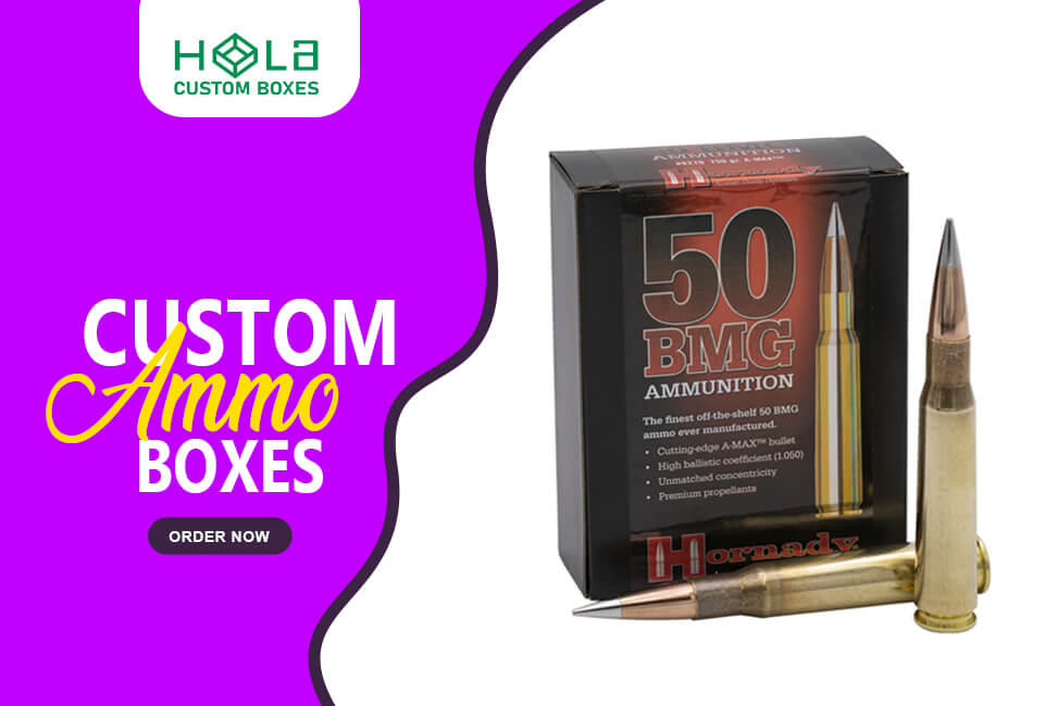
Graphic Design Standards for Ammunition Packaging: Caliber Visibility, Icons, Panels & Layout Strategy
Ammunition packaging succeeds or fails in the first two seconds of visual contact. Unlike lifestyle retail products, ammunition is rarely browsed casually. It is selected with purpose. The buyer’s priority is compatibility and performance clarity, not storytelling. That means packaging must function as a precision communication tool long before it functions as branding.
When developing packaging with a professional Cardboard Ammo Box Manufacturer, the graphic structure should be treated with the same engineering discipline as the board grade, compression strength, and closure design. At Hola Custom Boxes, structural integrity and visual hierarchy are developed together because clarity reduces errors, and reduced errors protect both retailers and end users.
If caliber visibility is compromised, the entire design system fails.
Caliber Must Lead the Hierarchy — Not the Brand
In ammunition packaging, compatibility always outranks branding. The caliber is the single most important piece of information on the box. It determines firearm fit, safety, and purchase correctness. Therefore, it must dominate the visual field.
Designers often underestimate how quickly buyers scan shelves. The eye does not leisurely read; it searches for the one data point that confirms compatibility. That search must end immediately. When caliber is the largest typographic element, placed in a predictable location and supported by strong contrast, recognition becomes automatic.
This is not merely a size decision. It is a systems decision. The caliber should occupy the same location across an entire product line so repeat buyers develop muscle memory. When position changes between SKUs, the eye must re-learn the layout, and hesitation increases.
Typeface selection plays a major role. Decorative or condensed fonts may look distinctive but compromise legibility under glare or distance. Ammunition packaging performs best with sturdy sans-serif or low-contrast slab typefaces that preserve numeral clarity. Characters such as 6, 8, 0, 1, and 9 must remain unmistakable in all lighting conditions.
At Hola Custom Boxes, front-panel templates are structured so the compatibility read zone always remains dominant, regardless of branding refreshes or SKU expansions.
The Single Scan Line Principle: Caliber, Grain & Quantity
.jpg)
Clarity improves dramatically when caliber, grain weight, and quantity appear together in one horizontal scan line. This alignment allows the buyer to confirm compatibility, load characteristics, and value simultaneously without scanning multiple areas of the box.
When these elements are separated across panels—caliber on the front, grain on a side flap, velocity on the back—the brain must assemble the data manually. That cognitive friction slows decisions and increases the likelihood of misreads.
A disciplined scan line presents the three most critical specifications as a unified information block. Caliber anchors the sequence. Grain weight sits immediately adjacent. Quantity follows without visual interruption. The spacing between them must be generous enough to avoid merging, yet tight enough to feel connected.
Consistency across product families allows changes in load data without redesigning the entire visual structure. This is especially important for manufacturers offering multiple grain weights within the same caliber. A structured scan-line system ensures brand stability while maintaining immediate readability.
Typography That Withstands Real Retail Conditions
Retail lighting is unpredictable. Ammunition boxes may sit behind glass, under fluorescent glare, or in dim counter environments. Typography must perform in all conditions.
Thin strokes disappear. High-contrast serif faces break apart at small sizes. Condensed fonts compress numerals, reducing clarity at arm’s length. The solution is not stylistic experimentation; it is optical reliability.
Numerals should use tabular or lining figures so weights such as 115, 124, and 147 align cleanly and remain visually balanced. Letterspacing must be controlled to prevent crowding while avoiding excessive tracking that fragments the word shape.
Contrast is equally important. Dark typography on light panels consistently outperforms low-contrast combinations. If reversed type is required, stroke weight must increase to compensate for ink spread and glare reflection.
Ammunition packaging typography is not about personality—it is about precision communication.
Icons as Immediate Visual Shortcuts
Icons reduce reading time when designed with discipline. They should not be decorative ornaments; they should be decision aids.
Bullet profile indicators, casing material symbols, velocity classifications, and intended-use markers can accelerate comprehension when executed as a unified system. Inconsistent stroke weights, misaligned baselines, and mismatched geometries disrupt visual harmony and create confusion.
Icons should sit near the primary scan line so they reinforce compatibility data rather than distract from it. Overcrowding the front panel with badges and marketing seals undermines clarity. Each symbol must justify its space.
When no industry-standard icon exists, proprietary symbols must remain literal and intuitive. Clever metaphors slow recognition. In ammunition packaging, simplicity wins every time.
Hola Custom Boxes integrates icon systems within dieline constraints to ensure print alignment and structural fold integrity do not distort symbol clarity.
Panel Strategy: Designing the Box as a Communication Surface
Every panel has a role. The front panel confirms compatibility. The side panels expand on technical data. The back panel houses regulatory requirements and extended warnings. When these zones blur, the design becomes noisy.
The most effective ammunition packaging reserves the central front panel for the dominant scan line and core specifications. Branding supports, but does not overwhelm. Secondary information remains accessible yet unobtrusive.
This structured zoning prevents what many packages suffer from: information congestion. When grain weight competes with marketing claims and multiple logos fight for attention, clarity collapses.
The box should feel ordered, not crowded.
Avoiding Layout Errors That Undermine Credibility
Design errors are rarely dramatic; they are subtle accumulations of friction.
Weak contrast under retail lighting.
Split specifications across multiple panels.
Inconsistent type hierarchy from SKU to SKU.
Crowded front panels filled with excessive claims.
Unpredictable placement of the compatibility data.
Each mistake increases cognitive effort. In a category where safety and compatibility are critical, any hesitation damages trust.
Structured grids and disciplined hierarchy eliminate these risks.
Print Finishes That Support Graphic Clarity
Graphic execution does not end at layout. Substrate and finishing choices directly affect legibility.
High-gloss coatings may enhance shelf appeal but increase glare, reducing readability. Matte aqueous coatings often provide superior optical performance while still protecting ink. Satin laminations balance scuff resistance with controlled reflection.
Oil-resistant coatings are particularly relevant in ammunition packaging, where handling conditions may involve contact with lubricants. Abrasion resistance ensures lot codes and barcodes remain scannable after transport and repeated handling.
Hola Custom Boxes aligns material science with graphic intent so finishes enhance, rather than compromise, communication clarity.
Designing for Multilingual Markets Without Expanding the Box
International distribution often requires multiple languages. Expanding text blocks can overwhelm panel real estate and disrupt hierarchy.
The most effective approach integrates universal icons, abbreviated specifications, and structured callouts that minimize duplication. QR codes can extend technical data without increasing panel density.
Compact typography systems, combined with disciplined zoning, maintain readability without enlarging packaging footprint.
Frequently Asked Questions
What legal markings are typically required on ammunition packaging?
Requirements vary by jurisdiction, but generally include manufacturer or importer name and address, caliber, quantity, lot number, safety warnings, age restrictions, hazardous-material markings where applicable, country of origin, and compliant barcodes.
Which print finishes perform best under repeated handling?
Matte or satin laminations paired with abrasion-resistant inks typically offer the best balance of durability and legibility. Oil-resistant coatings and moisture barriers further enhance performance in demanding environments.
How can sustainability goals be balanced with durability?
Sustainable packaging begins with certified substrates such as FSC paperboard and recycled content, but must also pass drop, compression, and moisture testing. Durability and recyclability should be evaluated together rather than treated as separate objectives.
What barcode standards apply to ammunition packaging?
Most U.S. retail products use UPC-A under GS1 standards, while international markets often require EAN-13. Barcodes must meet quiet-zone and placement requirements on flat, non-seam surfaces.
How can multiple languages be included without increasing packaging size?
Using shared iconography, abbreviated technical phrasing, and digital extensions such as QR-linked translations allows multilingual clarity without panel overcrowding.
Final Perspective
Effective ammunition packaging behaves like engineered signage. It communicates compatibility instantly, maintains clarity under stress, and preserves information integrity through handling and transport.
When caliber dominates, when grain and quantity align in a single structured scan line, when typography reads under glare, and when icons reinforce rather than clutter, the package becomes intuitive.
At Hola Custom Boxes, graphic systems are developed alongside structural engineering so clarity, durability, and compliance work together.
If you are seeking a professional Cardboard Ammo Box Manufacturer that understands both packaging performance and visual hierarchy, explore:
https://holacustomboxes.com
https://holacustomboxes.com/product/cardboard-ammo-box-manufacturer
In ammunition packaging, clarity is not aesthetic preference.
It is operational precision.