Custom Medicine Boxes: Addressing Challenges In Child-Resistant Packaging
2026-03-01 10:59:48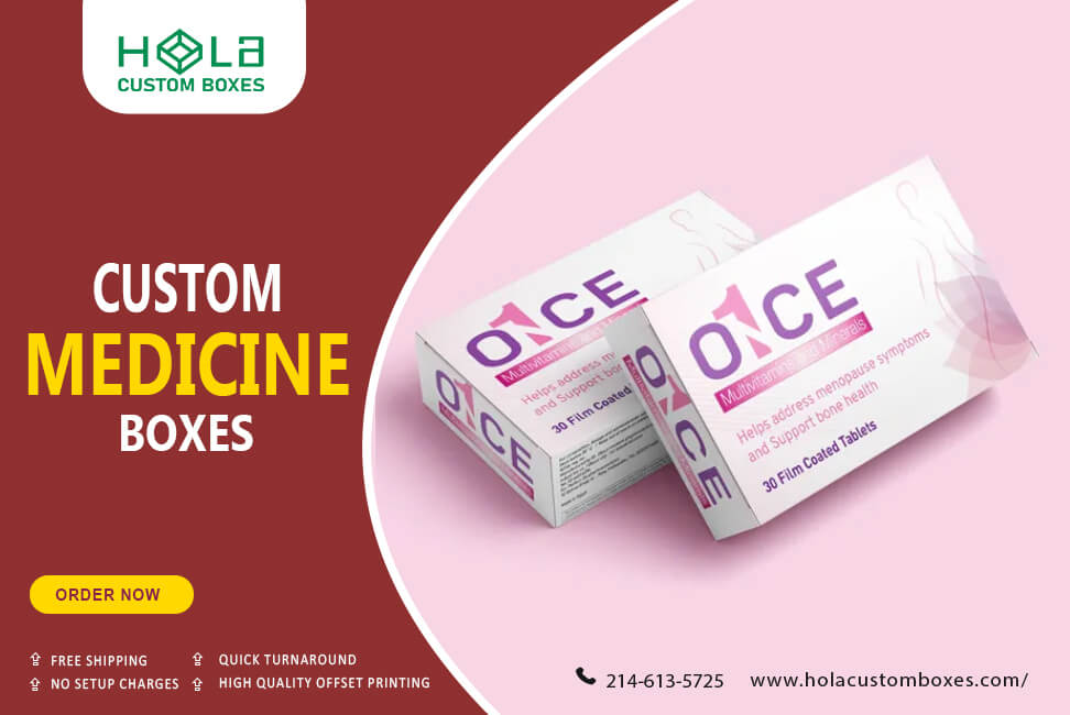
Child-Resistant Packaging: Why It’s No Longer Optional
Every year, thousands of children in the United States are treated in emergency rooms after accidentally ingesting medication. That reality makes one thing clear: child-resistant packaging isn’t just a “nice-to-have”—it’s a responsibility. Pharmaceutical brands, supplement companies, and OTC sellers are expected to protect children while still offering packaging that adults can open, understand, and use correctly. The challenge is balancing safety, accessibility, compliance, and brand presentation within a single packaging system.
At Hola Custom Boxes, we see child-resistant packaging as a complete solution—not just a closure. The outer carton, internal fitments, labeling layout, and material selection all contribute to safer handling, better storage behavior, and fewer mistakes at home. When these parts are designed together, packaging stops being a cost center and becomes a safety feature that protects people and strengthens brand trust.
The Real Problems Behind Medication Safety at Home
Most medication accidents happen in everyday situations—busy mornings, travel, shared bathrooms, or household cabinets where items are within reach. Children are naturally curious, and many medications can look harmless if packaging is weak, confusing, or easy to open. Even when brands use a child-resistant cap, the outer packaging may still fail to guide safe storage practices or clearly communicate warnings.
Another issue is medication mix-ups. Similar-looking cartons, unclear dosing instructions, and small print can lead to mistakes—especially when multiple family members take different medicines. Packaging that looks “premium” but ignores readability can actually increase risk. That’s why well-structured cartons, clear panel hierarchy, and tamper-evident elements matter just as much as the child-resistant mechanism itself.
Packaging Innovation Is Changing the Safety Standard
Modern packaging technology has moved beyond plain cartons and generic closures. Today, brands can use structural engineering and smart layout design to embed safety throughout the pack. For example, better carton locks, secure inner trays, and blister-aligned inserts reduce accidental access and keep doses organized. Tamper-evident seals and tear strips also add a clear “opened vs. unopened” signal—a vital trust factor for pharmacies and consumers.
Sustainability is also reshaping this space. Many brands want packaging that protects kids while reducing waste and environmental impact. That means selecting recyclable paperboard, reducing plastic when possible, and designing inserts that maintain protection without overpacking. With custom engineering, eco-conscious packaging can still meet safety expectations without sacrificing print quality or shelf presence.
Why Custom Medicine Boxes Make Child-Resistance Easier
Generic cartons often force brands into compromises: weak closures, poor fit, confusing labels, or excessive empty space that makes products rattle. In contrast, custom cartons are built around the product—its container shape, its required instructions, and its safety needs. This is where custom medicine packaging becomes a practical advantage, not just a branding choice.
With Hola Custom Boxes, brands can create cartons that support child-resistance through structure (stronger locking styles and tighter fits), communication (clear warnings and storage guidance), and performance (durable board that holds shape in transit and retail handling). If you’re building or upgrading your pharmaceutical packaging, start with custom printed medicine packaging boxes so the safety plan is designed into the packaging from day one.
Child-Resistant Design Features That Actually Work
True child-resistance usually comes from a layered approach. A strong outer carton can reduce accidental access and limit exposure, while a properly matched inner pack (like a blister system or a secure tray) helps control dosage handling. Even small structural decisions—such as tighter tuck flaps, reinforced edges, or tamper-evident seals—can discourage casual opening and provide clearer safety cues for caregivers.
Equally important is the way information is presented. A box can be “child-resistant,” but still unsafe if adults misread dosage directions or can’t quickly identify the product. The best designs use panel hierarchy: clear product name, visible dosage form, high-contrast warnings, and storage instructions placed where users naturally look first. This kind of packaging doesn’t just comply—it reduces risk in real life.
Adult Accessibility Without Sacrificing Child Safety
One of the biggest packaging challenges is designing something difficult for kids but not frustrating for adults—especially seniors or people with limited hand strength. Adult accessibility improves dramatically when packaging uses smart ergonomics: better grip areas, clean opening guidance, and durable board that doesn’t tear unpredictably. Clear, larger text and readable typography also help reduce dosing errors and make everyday use smoother.
Accessibility can also mean inclusivity. Some brands add tactile indicators or braille on the outer packaging to help people with visual impairments manage their medication more confidently. When packaging is designed with real users in mind, it becomes safer overall—because the right person can use it correctly, while the wrong person (a child) is kept out.