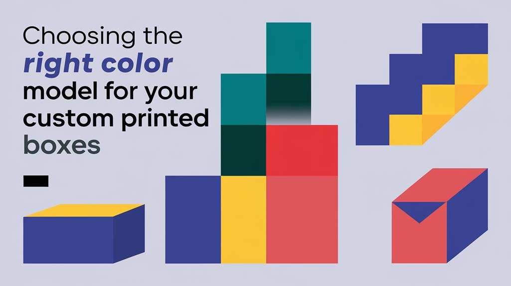
Choosing A Right Color Model for Your Custom Printed Boxes
2025-08-04 12:42:42.jpg)
Selecting the right color model for your boxes is essential for effective branding and consumer appeal. The RGB model is ideal for digital designs, harnessing vibrant light to create eye-catching visuals. In contrast, CMYK is the go-to for print, lending depth and richness to your packaging. Understanding color psychology can enhance your brand's impact; for instance, bold reds can drive appetite, while serene blues evoke trust. Always conduct mock-ups and printed proofs to guarantee colors align with your vision and market expectations. By exploring these aspects, you can elevate your packaging and capture consumer attention more effectively.
Main Points
- Choose RGB for digital designs and CMYK for print to ensure accurate color representation on boxes.
- Utilize Pantone Matching System (PMS) for standardized color reproduction across different materials and processes.
- Conduct printed proofs to verify color accuracy and adjust designs based on printer calibration and paper type.
- Consider cultural significance and market trends in color choices to effectively resonate with your target audience.
- Ensure consistency in color application to reinforce brand identity and enhance consumer recognition.
Overview of Color Models For Custom Printed Packaging
Color models serve as the foundational language for visual representation in both digital and print mediums. The RGB color model stands out for its application in digital displays. It combines Red, Green, and Blue light to produce a spectrum of colors. When all three are merged, they create luminous white, a hallmark of digital vibrancy.
In contrast, the CMYK model—Cyan, Magenta, Yellow, and Black—dominates the printing world. It employs a subtractive process that subtracts light to achieve depth and richness, culminating in black when combined.
For designers seeking consistency, the Pantone Matching System (PMS) provides a standardized method for color reproduction, ensuring uniformity across various materials. Meanwhile, the HSL (Hue, Saturation, Lightness) model offers an intuitive approach to color selection, allowing designers to manipulate colors based on human perception, enhancing the creative process.
Furthermore, the LAB color space emerges as a robust model, ensuring accurate color representation across different devices and media, enabling precise adjustments regardless of technology. Together, these color models form a thorough toolkit for achieving the desired visual impact in any design project.
Understanding the Differences Between RGB and CMYK
RGB (Red, Green, Blue) and CMYK (Cyan, Magenta, Yellow, Black) are two distinct color models, each optimized for different mediums. RGB is used for digital screens and relies on additive color mixing through light, while CMYK is the standard for print and uses subtractive mixing with ink. Recognizing their unique applications is essential for maintaining visual consistency across digital and print platforms.
Ensuring Color Accuracy in Print Design
Designers must be cautious when transitioning from RGB to CMYK, as colors that appear vibrant on screen may look different in print. To ensure accurate reproduction, it’s crucial to design using CMYK profiles and align with printer specifications. Additionally, requesting printed proofs is recommended for high-stakes projects, as factors like printer calibration and paper type can significantly affect the final result.
Importance of Color Selection In Printed Boxes
The choice of color in packaging goes beyond mere aesthetics; it plays a fundamental role in shaping consumer perceptions and driving purchasing decisions. Color schemes in packaging colors can evoke emotions and associations that greatly influence buyer behavior, accounting for up to 85% of purchase decisions.
For instance, vibrant reds can stimulate appetite, making them ideal for food products, while serene blues foster trust and reliability, appealing to consumers in sectors such as healthcare.
Effective color selection enhances brand recognition, potentially increasing it by up to 80%. This is essential in a crowded marketplace where standing out is crucial. Consistency in the application of chosen colors across products not only reinforces brand identity but also cultivates familiarity and loyalty among consumers.
Understanding the cultural significance and current market trends in color choices is essential for creating packaging that resonates with the target audience. Businesses can forge deeper connections with their customers by strategically selecting packaging colors that reflect brand values and consumer preferences, ultimately driving sales and enhancing overall brand perception.
Consequently, the importance of color selection cannot be overstated; it is a powerful tool in the art of adequate packaging.
Tips for Choosing Colors For Custom Boxes
Selecting the right colors for packaging can be a transformative experience for the product and its potential consumers. To guarantee your product packaging stands out and resonates with your target audience, consider the following tips:
Conduct Market Research: Identify color options that align with current trends in your industry and resonate with your target market. Understanding consumer preferences can guide you in selecting the right colors for your packaging design.
Utilize Color Theory: Leverage principles of color theory, such as complementary and contrasting colors. This approach creates visually appealing combinations and enhances product visibility on shelves, making it more likely to catch the eye of potential buyers.
Test Color Combinations: Make mock-ups or prototypes to gauge consumer reactions before finalizing your choices. Seek feedback through focus groups or surveys to refine your color changes based on emotional responses, guaranteeing that your selected colors resonate with your audience effectively.
Color Psychology in Packaging
Color psychology considerably shapes consumer behavior, making it an essential consideration in packaging design. The colors selected for packaging attract attention and evoke specific emotions that influence consumer perception and decision-making.
For instance, red ignites appetite and energy, making it a popular choice in the food industry, while blue instills a sense of trust and reliability, often favored by service-oriented brands.
In contrast, green symbolizes health and eco-friendliness, appealing to a growing demographic of consumers who prioritize sustainability. This connection enhances brand identity, as products wrapped in green hues resonate with environmentally conscious buyers.
Meanwhile, black embodies luxury and sophistication, attracting consumers seeking premium products.
Consistency in color usage can bolster brand recognition by up to 80%, reinforcing a cohesive brand identity that fosters customer loyalty.
However, understanding the cultural significance of colors and current trends is paramount, as preferences vary widely among different demographics.
Practical Considerations for Printing
When starting on the journey of printing boxes, understanding the nuances of color models becomes essential for achieving the desired visual impact. The choice of CMYK is paramount, as this color model is specifically designed for accurate physical representation, ensuring color accuracy that digital models like RGB cannot provide.
To enhance the quality of your printed boxes, consider these practical steps:
Printer Calibration: Regularly calibrate your printer to minimize color variations, ensuring the colors you see on-screen align with the final printed output.
File Formats: Always use PDF for CMYK printing. Unlike JPG formats, which can lead to detail loss when converted, PDFs maintain the integrity of your design, providing a crisp, high-quality finish.
Printed Proofs: Before finalizing your designs, conduct printed proofs. This step allows you to verify that colors appear as intended on the product and make necessary adjustments, safeguarding your visual vision.