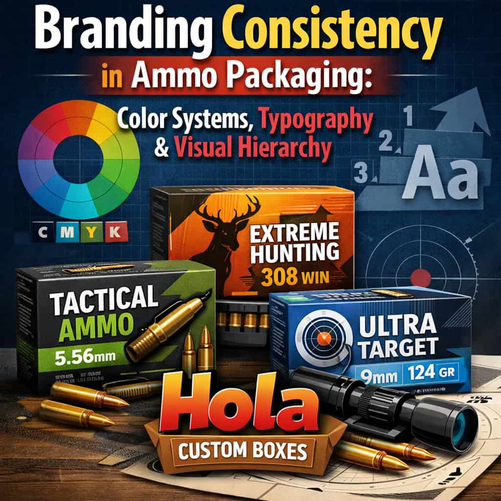
Branding Consistency in Ammo Packaging: Color Systems, Typography & Visual Hierarchy
2026-01-10 12:07:02
Branding Consistency in Ammo Packaging: Color Systems, Typography & Visual Hierarchy
You can’t build trust in ammo packaging if every box looks like a one-off. You need a brand system that stays stable while your SKUs multiply, so shoppers can spot caliber, line, and key specs in seconds. That means assigning caliber colors as navigation, keeping product-line colors secondary, and locking typography and hierarchy so nothing competes for attention. The question is where you set the rules—and what you never let change.
Main Points
- Establish a packaging brand system with locked logo rules, clear-space, minimum sizes, and print-ready specs to prevent drift.
- Assign one non-negotiable color per caliber for navigation, with tightly specified CMYK/RGB/HEX values and consistent placement.
- Use a small secondary palette for product lines, keeping caliber color constant while signaling tiers through controlled accents.
- Standardize typography for two-foot legibility: open counters, clear numerals, consistent casing, and a fixed spec sequence with separators.
- Implement one grid across all panels to lock hierarchy—brand first, specs second, claims last—reducing layout errors and improving consistency.
Start With a Clear Ammo Packaging Brand System
A brand system is your packaging playbook. It tells you what stays constant across every box you ship, so customers spot you fast and trust what they’re buying.
Define your logo lockups, clear-space rules, and minimum sizes so marks don’t drift. Set typography standards: typefaces, weights, numerals, and line spacing, plus rules for barcode and legal copy.
Establish a grid, margins, and alignment so panels feel related even when copy changes. Specify materials and finishes—matte vs gloss, foil, spot UV—so tactile cues stay consistent at retail.
Document photography and illustration style, icon sets, and warning symbols so graphics don’t look mixed-source. Create templates for key SKUs with front, side, and end-panel layouts, then add a review checklist.
When you control these basics, production moves faster and quality stays predictable.
Define Caliber vs Product-Line Color Roles
Once your brand system locks down what stays consistent, color becomes the fastest way to organize your lineup without breaking that consistency.
Your next step is defining what color means: caliber identification or product-line positioning. If you let one hue do both jobs, you’ll create conflicts—especially when multiple calibers live inside one line or when one caliber appears across several lines.
Treat caliber colors as navigational signals: they help shoppers scan the shelf, confirm compatibility, and reduce hesitation.
Treat product-line colors as brand storytelling: they communicate performance tier, use case, or feature set at a glance. Then decide which role gets priority in each zone of the panel.
For example, you can reserve one area for quick ID and another for line identity, supported by typography and icons. This division keeps your system scalable, so new SKUs won’t force redesigns or muddy recognition later.
Assign a Consistent Color per Caliber
Pick one color for each caliber and lock it in across every product line, box size, and panel placement, so shoppers learn the code and trust it instantly. Treat that caliber color as a non-negotiable identifier, like the caliber name itself.
Define it in a tight spec: CMYK/RGB/HEX values, coated and uncoated equivalents, plus acceptable tints and minimum contrast against your backgrounds.
Apply it where buyers look first: the caliber callout, corner tabs, and shelf-facing edges. Keep placement consistent so the same hue signals the same caliber even when boxes are stacked, partially covered, or viewed at an angle.
Build a simple production checklist so printers don’t drift: approved ink formulas, proof targets, and tolerances. When you introduce new calibers, extend the palette intentionally and document it immediately, so your system scales without collisions or confusion.
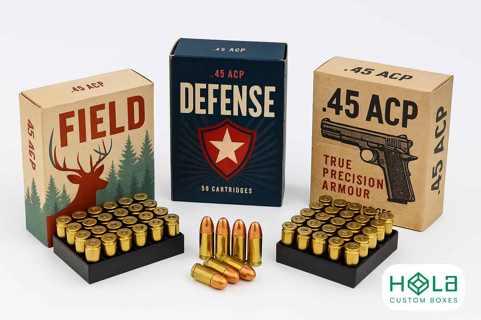
Keep Product Lines Distinct With Secondary Colors
After you’ve locked a single, unmistakable color to each caliber, use secondary colors to separate your product lines without breaking that code.
Treat the caliber color as the constant, then layer line cues on top: a narrow band, corner flag, or background tint that never overwhelms the primary hue. This lets 9mm stay 9mm across every box while “Range,” “Duty,” and “Match” read as distinct families.
Build a small secondary palette with clear rules. Assign one accent to each line, then repeat it across all calibers in that line.
Keep saturation and placement consistent so the cue feels intentional, not decorative. Pair the accent with a matching icon set or pattern to reinforce the line without adding text clutter.
Finally, document the percentages and print specs so every run matches—especially between matte and gloss stocks and different printers.
Choose Colors Shoppers Recognize Fast
A crowded shelf moves like a blur, so your color choices have to register in a heartbeat. Pick a primary hue that shoppers already link to your brand, then use it boldly and consistently across every box face. High-contrast pairings help: dark backgrounds with bright marks, or light fields with deep accents, so the name and caliber pop from three feet away.
Limit your palette to a few reliable colors, and assign each a job—brand block, product type, performance tier, or safety cues. Don’t rely on subtle shades; use clear, separated tones that stay readable under harsh retail lighting.
Keep legal text and warnings neutral so they don’t steal attention from the buying signals. When a customer scans quickly, familiar color + strong contrast guides their eyes straight to your line, even when competitors shout louder. That instant recognition protects repeat buys and reduces hesitation at the shelf.
Stop Color Drift With Print-Ready Specs (CMYK/Pantone)
Even if your design looks perfect on-screen, color will drift fast once it hits different presses, paper stocks, and coatings unless you lock it down with print-ready specs.
Build your palette in two languages: Pantone for spot-critical brand colors and CMYK builds for process runs. Specify the exact Pantone number, ink series, and whether you’re printing coated or uncoated, because that choice shifts saturation.
Build your palette in two languages: Pantone for spot-critical hues, CMYK for process. Specify ink series and coated vs uncoated to prevent shifts.
For CMYK, don’t rely on “rich” guesses—publish the precise percentages, total ink limit, and black strategy (K-only for small type, rich black for large fields). Include tolerances: acceptable ΔE, dot gain assumptions, and gray balance targets.
Call out paper stock, coating, and varnish because they change contrast and perceived hue. Supply vector artwork with embedded profiles, overprint settings, and trap notes so your vendor can’t interpret.
When you standardize these specs, every lot stays shelf-consistent and recognizable.
Proof Colors for Digital Listings and Lighting
Print-ready specs keep your cartons consistent on press, but customers often meet your ammo brand first through a product photo or thumbnail. If your reds shift to orange online or your blacks lift to charcoal, shoppers will question authenticity and lot-to-lot reliability.
Build a digital proofing step alongside print proofing. Convert key brand colors to sRGB and Display P3 targets, then check them on calibrated monitors and common phones. Request marketplace image requirements early, and export test thumbnails to see what survives compression and small sizes.
You’ll also want controlled lighting. Shoot under consistent 5000K–5600K sources, gray-card your first frame, and lock white balance so cartons don’t drift between sessions.
If retailers provide their own photos, send a lighting and color reference sheet plus a master image for comparison. Finally, view images on dark and light backgrounds to confirm contrast stays consistent across listings.
Pick Typography That’s Legible at Arm’s Length
Two feet is the real typographic test for ammo packaging: if shoppers can’t read your caliber, grain weight, and load type at arm’s length, they’ll hesitate or grab a competitor.
Choose typefaces built for quick decoding, not style points. Start with a sturdy sans or a low-contrast serif with open counters, generous x-height, and clear numerals. Avoid condensed widths, ultra-thin strokes, and quirky alternates that blur on matte stocks or under shrink wrap glare.
Pick typefaces for fast decoding: sturdy sans or low-contrast serif with clear numerals; avoid condensed, ultra-thin, or quirky alternates.
Set minimum sizes based on real print, not mockups: print a test sheet, tape it to a shelf, and read it from two feet in fluorescent, daylight, and warm aisle lighting. Increase letterspacing slightly for small caps, and keep line spacing roomy so characters don’t merge.
Use consistent casing rules, and reserve italics for short cues only. Finally, pair type with strong contrast and clean edges to prevent halation and fill-in.
Set a Fixed Hierarchy for Caliber and Load Specs
Because shoppers scan ammo shelves in seconds, you need a fixed visual hierarchy that makes caliber the loudest signal, then backs it up with load specs in a predictable order.
Put caliber on the primary focal line and keep it there across every SKU, so buyers don’t hunt when they compare options.
Next, present the key load spec sequence the same way every time: bullet weight, bullet type, velocity/pressure note if relevant, then quantity.
Don’t shuffle those fields between hunting, target, and defensive lines; consistency beats cleverness.
Use clear separators so specs read as a quick checklist, not a paragraph.
If you offer multiple loadings in one caliber, keep the caliber unchanged and let the load line differentiate, so the eye confirms fit first and performance second.
Finally, reserve secondary claims—“match,” “bonded,” “lead-free”—for supporting positions, not above the caliber.
Standardize Type Sizes, Weights, and Spacing
One typography system can do more for shelf clarity than another round of label copy. Lock in a small set of type sizes for every information tier—caliber, load specs, product name, warnings, and legal lines—then don’t improvise.
When you keep the same point sizes across SKUs, customers learn your pattern and scan faster. Pair those sizes with fixed weights: bold only where you need instant pickup, regular for supporting data, and light sparingly for secondary notes. Don’t let “bold creep” dilute emphasis.
Standardize spacing, too: set consistent line spacing for each size, and keep predictable gaps between headers and details so text blocks breathe without drifting. Use the same numeral styling and abbreviations everywhere, and pick one method for unit formatting (gr, fps, oz).
You’ll reduce layout errors, speed approvals, and protect readability under glossy coatings and low retail light.
Use a Consistent Grid for Every Box Panel
Even if your copy and type system stay locked, your packaging can still look messy if each panel uses a different layout logic. You fix that by committing to one grid and applying it everywhere: front, back, ends, top, and bottom.
Choose a column count, baseline rhythm, and consistent margins, then don’t improvise.
Build a master dieline template with grid guides so every panel shares the same edge offsets, line breaks, and alignment points. Snap logos, headers, icons, and tables to common rails so they line up across folds.
Keep gutters consistent to prevent cramped corners and awkward white gaps. Use the grid to control hierarchy through placement, not random size changes.
When you revise a SKU, you’ll swap content without rethinking composition. Printers will thank you, too: predictable spacing reduces trapping risks and makes color bars and cut tolerances easier to manage.
Set Rules for Brand vs Specs vs Claims
.jpg)
A consistent grid keeps every panel aligned, but you’ll still lose cohesion if brand elements, technical specs, and marketing claims compete for the same visual attention.
Set a fixed hierarchy: brand first, specs second, claims last. Give the logo the most contrast and the cleanest space; don’t let it share a line with caliber or load data.
Set a fixed hierarchy: brand first, specs second, claims last—give the logo clean space and the strongest contrast.
Lock specs into a predictable block with strict labels and units (Caliber, Bullet, Weight, Velocity), and keep the type size and weight consistent so shoppers can scan fast.
Treat claims as supporting copy: one primary claim max on the front, shorter than a single line, and never styled louder than the brand.
Use one badge shape for certifications or features, but cap the count so it doesn’t turn into clutter.
When you enforce these rules, every box reads like the same brand, even at arm’s length.
Scale the System Across SKUs Without Exceptions
Once you’ve locked the hierarchy, you’ve got to apply it to every SKU without “special case” exceptions, or the system collapses.
Treat each box as a module: same grid, same type scale, same placement for brand, caliber, grain, and load type. If a new offering needs emphasis, don’t invent a new badge—use the system’s existing claim slot and weight rules.
Build a SKU matrix that lists every variable (caliber, projectile, quantity, velocity class, sub-brand) and map each to a controlled visual token: color band, icon, or short descriptor.
Keep token counts fixed so the front panel never grows new rows. When space gets tight, shorten copy, not structure.
Standardize photography or illustrations by crop, angle, and contrast so they don’t overpower text.
Finally, audit proofs side-by-side; if two SKUs don’t look related at arm’s length, you’ve broken the system.
Add Anti-Counterfeit Cues Without Clutter
Trust is the quiet feature your ammo box has to sell, so you should build anti-counterfeit cues into the same grid you already use.
Start with one primary authentication element and give it a fixed home—like a corner badge or bottom band—so it reads as part of the hierarchy, not a stickered-afterthought.
Use microtype or fine line guilloché patterns inside existing color blocks to add complexity without adding new shapes.
Pick a single metallic ink or spot varnish as your “trust accent,” then apply it consistently to the brand mark or caliber callout, not everywhere.
Add a short verification URL or QR code, but keep it secondary: small, quiet, and aligned to typography baselines.
If you include serials, constrain them to one location and one font weight.
The goal: cues you can’t miss, and counterfeiters can’t mimic easily.
Audit Packaging Consistency With a Checklist
When you audit your ammo packaging with a checklist, you turn “looks about right” into a repeatable pass/fail system across every SKU.
Start with brand fundamentals: logo placement, clear space, and minimum size. Then lock color: verify Pantone/CMYK matches, contrast ratios, and background tints for each caliber tier.
Confirm typography: font families, weights, tracking, and consistent hierarchy for product name, load data, and safety language.
Next, check structure and layout: grid alignment, margins, barcode quiet zones, and regulatory blocks.
Validate icons and anti-counterfeit marks so they’re present, scannable, and not competing with key claims.
Add photography rules: lighting, angle, and crop, plus a ban list for filters.
Finally, include print and production checks: paper stock, finish, dieline accuracy, and legibility at shelf distance.
Run the list at concept, proof, and final press approvals.
Frequently Asked Questions
Do Packaging Color Choices Affect Legal Compliance or Safety Labeling Requirements?
Yes—your color choices can affect compliance if they reduce required contrast, obscure hazard symbols, or mimic regulated warning colors. You must keep mandatory text legible, follow standards, and avoid misleading safety cues on labels.
How Much Does Consistent Packaging Design Increase Repeat Purchases or Brand Loyalty?
You can boost repeat purchases and loyalty noticeably: consistent packaging typically lifts recognition and trust, so you’ll often see a 5–20% improvement in repurchase intent when quality matches. You should test A/B variants to confirm.
What Packaging Materials Best Preserve Ammunition Quality and Resist Moisture?
You’ll best preserve ammo with sealed polymer or metal tins plus foil-laminate barrier pouches. Add desiccant packs and corrosion-inhibitor paper. Choose moisture-resistant labels and heat-sealed seams, and avoid plain cardboard for long-term storage.
Should QR Codes Link to Ballistic Data, Manuals, or Warranty Registration?
Link QR codes to ballistic data first, then include manuals and warranty registration as secondary options. You’ll help users verify performance fast, troubleshoot safely, and register easily. Use a landing page so you can update content anytime.
How Do International Markets Change Ammo Packaging Requirements and Design Constraints?
International markets force you to meet varied legal markings, language translations, hazard icons, and import rules, so you’ll redesign layouts, sizes, and materials. You’ll also adapt cultural norms, metric units, and regional compliance testing demands.
Final Thoughts
When you build a clear brand system for ammo packaging, you make every box easier to spot, trust, and choose. You’ll guide shoppers with consistent color palettes, keep product lines distinct with smart secondary hues, and speed decision-making with fixed typography and a strong visual hierarchy. Set firm rules for what leads—brand, specs, or claims—and don’t break them across SKUs. Add subtle anti-counterfeit cues, then audit regularly to maintain consistency.