Best Fonts and Colors for Cosmetic Packaging Branding
2026-06-04 20:26:55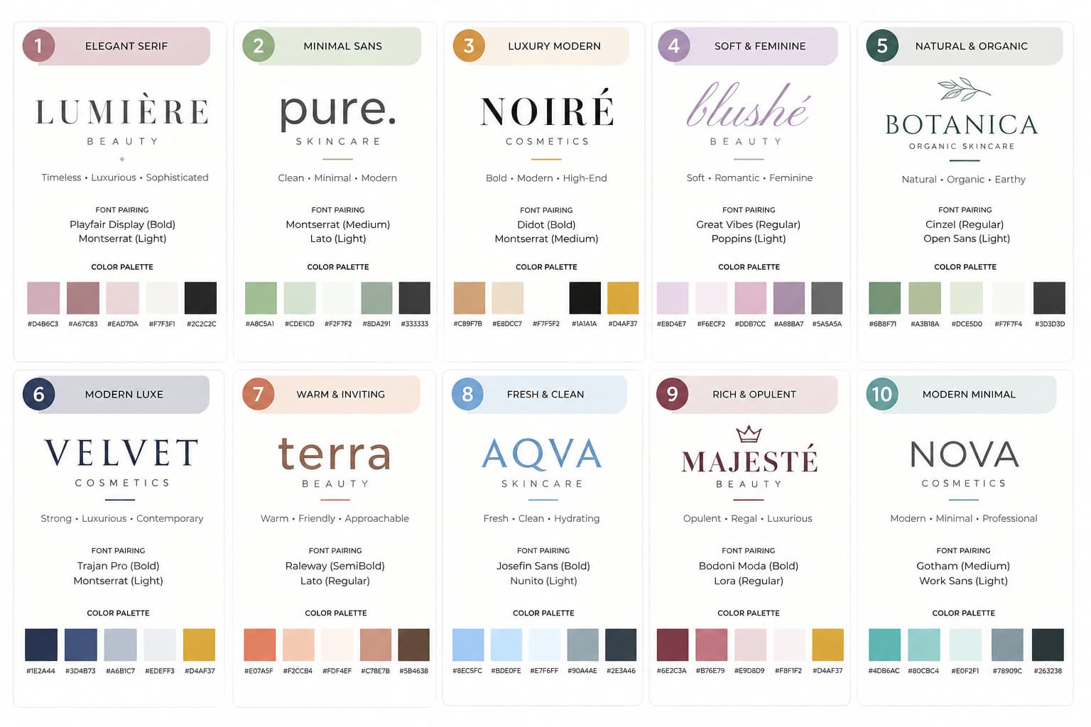
To elevate your cosmetic packaging branding, use vibrant colors to evoke emotions and attract attention. Red for passion, soft pastels for femininity, and green for eco-friendliness can enhance consumer appeal. Pair these colors with fonts that reflect your brand's personality—serif for sophistication, sans serif for modernity, or script for elegance. Thoughtful combinations and a strong typography hierarchy make a lasting impression. Keep exploring to find perfect styles that resonate with your audience.
Key Takeaways
- Choose serif fonts for sophistication or sans serif for a clean, modern appeal that aligns with your brand's identity.
- Utilize vibrant colors like fuchsia and teal to evoke energy, or soft pastels for a gentle, feminine touch.
- Combine bold typography for attention with playful lettering to attract younger demographics and infuse fun into your packaging.
- Prioritize sustainable materials in packaging design to appeal to eco-conscious consumers while enhancing brand loyalty.
- Maintain consistent typography and color schemes across all materials to reinforce brand identity and recognition.
Understanding the Psychology of Colors in Cosmetics
Colors play a crucial role in how consumers perceive cosmetic products. When you choose colors for your packaging, think about color symbolism and the emotional associations they carry. For instance, red often evokes passion and excitement, making it ideal for bold lipsticks. On the other hand, soft pastels like pink or lavender can convey gentleness and femininity, attracting a more delicate audience. Green suggests natural ingredients and eco-friendliness, appealing to health-conscious consumers. By understanding the psychology behind these colors, you can create a brand image that resonates with your target market. Remember, the right color choice not only catches the eye but also influences emotions, guiding consumers toward making a purchase decision. So, choose wisely.
The best packaging designs combine font, color, material, and finish together. A matte black box with gold foil can look elegant. A white box with soft pink typography can feel clean and skincare-focused. A kraft box with black printing can feel natural and simple. Brands that want better packaging quality should also understand custom box printing, materials, and finishes because the final look depends not only on the design but also on how the design is printed and finished.
Top Font Styles for Beauty Brands
When choosing the right font for your beauty brand, you want to ensure it complements your overall aesthetic and resonates with your target audience. Serif fonts can evoke a sense of sophistication, making them great for brands with vintage aesthetics. In contrast, sans serif fonts offer a clean, modern look that suits minimalist styles perfectly. If you're aiming for elegance, script fonts add a touch of luxury and fluidity. For bold statements, bold typography can capture attention and convey confidence. Playful lettering works wonders for brands targeting a younger demographic, infusing fun into your packaging. Ultimately, your choice of font should reflect your brand's personality and create a cohesive identity that stands out in the beauty industry.

Color Combinations That Captivate Consumers
The right color combinations can make your cosmetic packaging unforgettable and drive consumer interest. To stand out, consider using vibrant palettes that evoke emotion and energy. Bold colors like fuchsia, teal, or sunny yellow can attract attention and create a lively brand image. Pair these vibrant hues with minimalist aesthetics to strike a perfect balance; less can often be more. For instance, a striking coral against a clean white background can convey freshness and elegance. Alternatively, soft pastels combined with muted tones can provide a soothing feel, appealing to a more relaxed audience. By thoughtfully choosing your color combinations, you’ll not only enhance your packaging but also foster a deeper connection with your customers, making your brand memorable.
Small beauty businesses should also keep their branding consistent across all packaging. If the lipstick box, serum box, skincare carton, and retail display box all use different fonts and unrelated colors, the brand can look unorganized. A better strategy is to create a clear packaging system with the same logo placement, font style, color palette, and design tone. This helps even a new brand look more established. For growing brands, custom packaging for small businesses can help create a stronger packaging foundation that works across different product types.
The Role of Typography in Brand Identity
Typography plays a crucial role in shaping your brand identity, influencing how consumers perceive your products. A well-established typography hierarchy directs attention to essential information, guiding customers through your brand’s message effortlessly. When you choose fonts that align with your brand’s personality, you enhance brand recognition and create a memorable experience. For instance, elegant script fonts might evoke luxury, while bold sans-serif fonts could suggest modernity and confidence. It's essential to maintain consistency across all packaging materials, as this reinforces your brand identity. By balancing legibility and style, you can make a lasting impression. Remember, the right typography doesn’t just communicate information; it tells your brand's story and connects emotionally with your audience, elevating your cosmetic packaging to new heights.
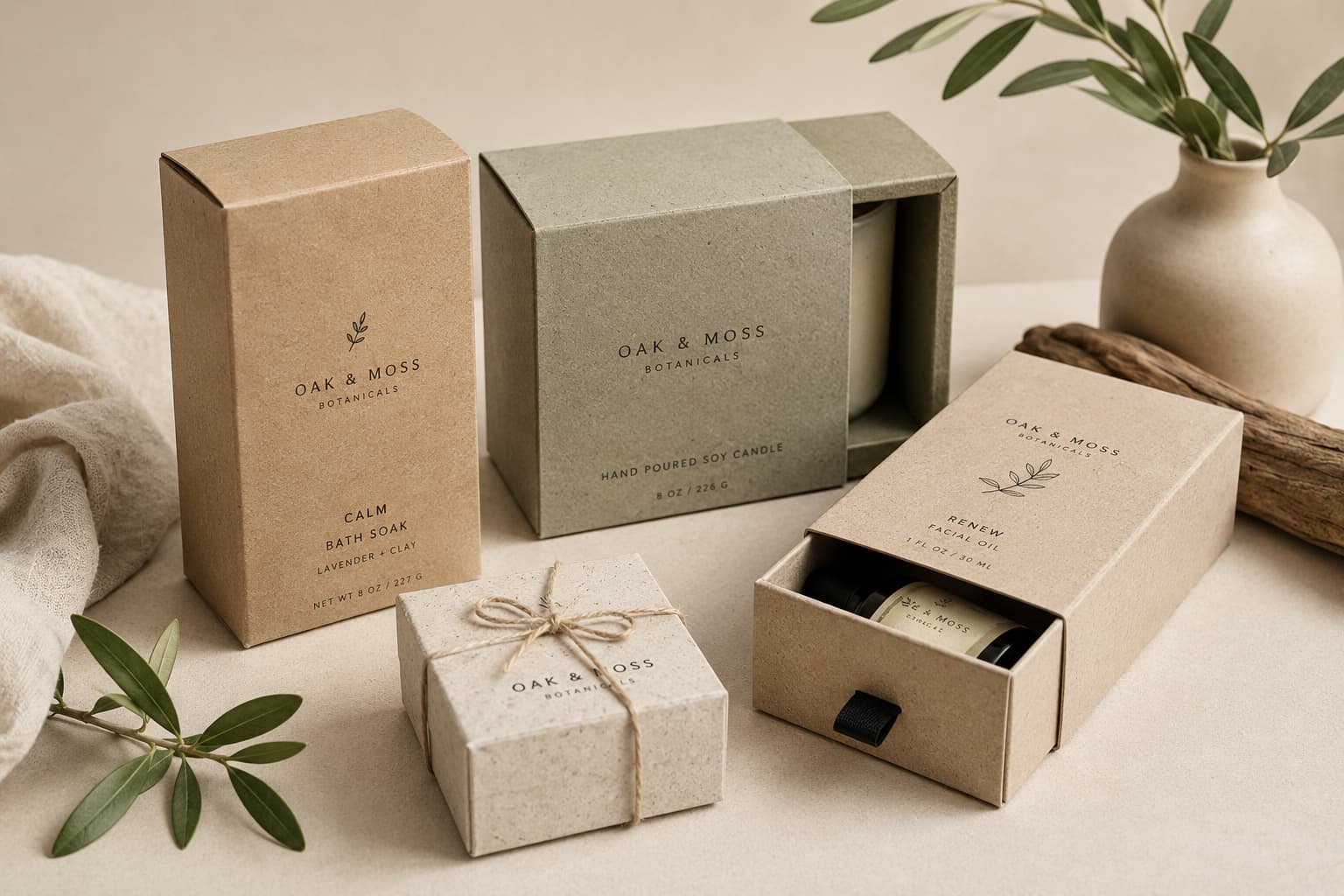
Sustainability can also influence cosmetic packaging colors and materials. Natural and clean beauty brands often use kraft, recycled paperboard, minimal printing, and soft earthy colors to support a responsible brand image. This does not mean the packaging has to look plain. With the right font, spacing, and logo placement, eco-friendly custom packaging boxes can still look premium, modern, and attractive for cosmetic customers. When fonts, colors, materials, and structure work together, cosmetic packaging becomes more than a box. It becomes a strong branding tool that builds trust, improves presentation, and helps customers remember the product.
Current Trends in Cosmetic Packaging Design
As consumer preferences evolve, staying ahead of current trends in cosmetic packaging design is essential for brands aiming to capture attention and drive sales. One prominent trend is the shift toward sustainable materials. More consumers are seeking eco-friendly options, so using recyclable or biodegradable packaging not only appeals to their values but also enhances brand loyalty. Additionally, minimalist designs are gaining traction. Clean lines and simple aesthetics create a modern look that resonates well with today’s audience. You’ll find that these designs often prioritize functionality, reducing excess waste while remaining visually appealing. By embracing sustainable materials and minimalist designs, you can effectively position your brand as innovative and responsible in a competitive market.
Fonts and colors play a major role in how customers judge cosmetic packaging before they even try the product. A beauty product may have a strong formula, but if the box uses weak colors, hard-to-read fonts, or a messy layout, the product can look less trustworthy. Good cosmetic packaging branding starts with clarity. The customer should quickly understand the brand name, product type, shade, benefit, and overall feeling of the product. This is why cosmetic brands should choose fonts and colors carefully instead of adding random design elements only to look different.
For cosmetic packaging, font choice should match the brand personality. A luxury skincare brand may use elegant serif fonts, thin modern typography, or clean spacing to create a premium feeling. A bold makeup brand may use stronger fonts, sharper shapes, and high-contrast colors to create energy and confidence. A natural beauty brand may use soft fonts, earthy tones, and simple layouts to create a clean and honest look. The font should be readable on every part of the box, especially on small product packaging like lip balm boxes, eyeliner boxes, serum boxes, or cosmetic cartons. Beautiful typography is useless if customers cannot read the product name or important details.
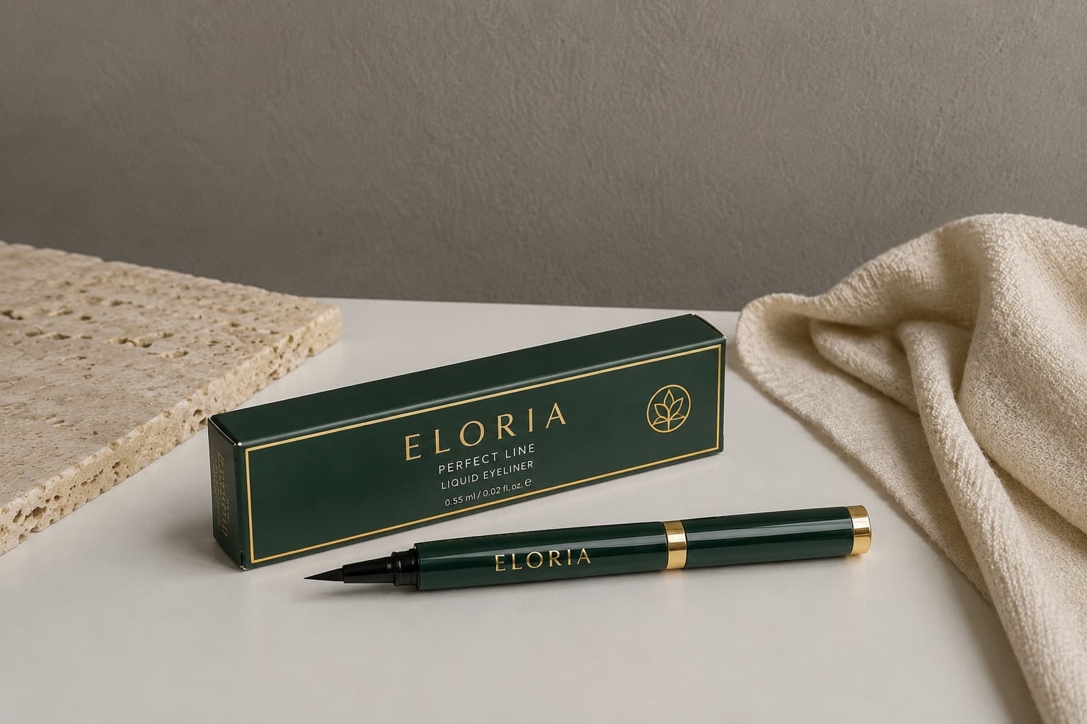
Color is just as important as font. Soft pastel colors can work well for skincare, gentle beauty products, and feminine cosmetic lines. Black, white, gold, silver, and deep neutral tones can make packaging feel more luxurious. Kraft brown, beige, green, and muted natural shades can support organic or eco-conscious branding. Bright colors can work for fun makeup products, but they should still feel controlled and professional. A cosmetic box should not use too many colors at once because too much visual noise can make the product look cheap instead of premium.
Retail presentation should also guide font and color choices. Cosmetic products often compete on shelves, in boutiques, salons, and online stores. Packaging should be attractive enough to stand out but clear enough to explain the product quickly. Strong front-panel design, readable typography, and balanced colors can help customers understand the pro6duct faster. Brands selling in stores can also use custom retail product boxes to create packaging that feels professional, shelf-ready, and easier to recognize.
Conclusion
In the world of cosmetic packaging, the right fonts and colors can make all the difference in how your brand is perceived. By understanding color psychology and choosing the perfect typography, you can create a compelling identity that resonates with consumers. Remember, first impressions are everything, so don’t underestimate the power of visual appeal. Stay ahead of the curve by keeping an eye on current trends, and your brand will surely shine in a competitive market.
FAQs
What fonts are best for cosmetic packaging?
The best fonts for cosmetic packaging are clean, readable, and matched with the brand personality. Luxury skincare brands often use elegant serif or modern minimal fonts, while bold makeup brands may use stronger typography to create a more confident look.
What colors make cosmetic packaging look premium?
Black, white, gold, silver, soft beige, nude, pastel pink, and deep neutral colors can make cosmetic packaging look premium. The key is to use colors with balance and avoid overcrowding the box with too many shades.
Why are fonts and colors important in cosmetic packaging?
Fonts and colors help customers understand the product, recognize the brand, and judge the quality of the packaging before buying. Good font and color choices can make cosmetic boxes look more professional, trustworthy, and retail-ready.
How many colors should a cosmetic box design use?
Most cosmetic box designs should use 2–4 main colors. Too many colors can make the packaging look messy, while a focused color palette makes the box look cleaner and more premium.
Should luxury cosmetic packaging use bold or simple fonts?
Luxury cosmetic packaging usually works better with simple, elegant, and readable fonts. The design should feel clean and confident instead of loud or overcrowded.
What colors work best for eco-friendly cosmetic packaging?
Eco-friendly cosmetic packaging often works well with kraft brown, beige, white, green, soft earth tones, and minimal black printing. These colors help the packaging feel natural, clean, and responsible.
Can the wrong font make packaging look cheap?
Yes, the wrong font can make cosmetic packaging look cheap or unprofessional. Fonts that are hard to read, too decorative, or poorly spaced can weaken the product’s first impression.
How can small cosmetic brands choose the right packaging colors?
Small cosmetic brands should choose colors based on their product type, target customer, and brand style. Skincare brands often use soft and clean colors, while makeup brands can use bolder shades if they match the product identity.