Don't Waste Your Budget: Avoiding the Most Common Custom Packaging Design Flaws
2026-03-01 15:54:32
Don't Waste Your Budget: Avoiding the Most Common Custom Packaging Design Flaws
Your custom packaging is your brand’s single greatest tangible asset. It’s the handshake with the consumer, the moment of truth where perception meets reality. Yet, far too many brands, both startups and established names, fall into predictable traps during the design and pre-press process. These mistakes not only look unprofessional but also lead to expensive reprints, production delays, and ultimately, a wasted marketing budget.
To help you ensure your custom product packaging translates perfectly from screen to shelf, we’ve compiled the ultimate guide to the most common design flaws and how expert manufacturers avoid them.
Flaw #1: Ignoring the Die-Line and Scale Errors
The die-line is the engineering blueprint of your box. It dictates every cut, crease, and glue tab. Treating the die-line as a mere template rather than a precise technical document is the number one cause of costly packaging mistakes.
The Die-Line Disconnect
Designers often treat packaging artwork like a flat brochure. They fail to account for how colors wrap around corners or how folds affect text placement.
Bleed Mismanagement: The bleed is the area of color or image that extends beyond the final cut line. If the color doesn't reach the bleed, tiny, unsightly white gaps will appear after the box is cut. The standard is usually 1/8 inch (3mm), and if your design elements don't extend into it, you're guaranteed a reprint.
Safety Zone Violation: Conversely, the safety zone is the inner margin where critical text, logos, and warning labels must reside. Placing essential elements too close to the edge risks having them clipped during cutting or disappearing into a fold.
Grain Direction Neglect: Cardboard has a "grain" similar to wood. Placing a crease line against the grain can cause the cardboard to crack and fray, especially with heavily inked or dark areas. Your manufacturer should guide you on the optimal grain direction for structural integrity.
The Fix: Always request and work directly within the manufacturer's die-line template. Use layers in your design software to visually separate the final cut lines, the bleed, and the safety zones.
Flaw #2: Color Mismanagement and PMS Mismatch
Color is identity. If your custom cosmetic boxes or retail cartons don't match your signature brand color, the consumer loses trust immediately. This problem usually stems from confusion between color models.
RGB vs. CMYK vs. PMS
Designing in RGB: Red, Green, Blue (RGB) is the color model used by screens, monitors, and digital cameras. It has a vast color gamut that simply cannot be reproduced in print. Designing your file in RGB and then converting it to CMYK just before printing will result in duller, darker, and often unexpected colors.
Misunderstanding CMYK: Cyan, Magenta, Yellow, and Key (Black) is the four-color process used in standard printing. While great for photographic images, CMYK can be inconsistent for solid, large blocks of a single brand color (like Coca-Cola red or Tiffany blue).
Neglecting PMS (Spot Colors): The Pantone Matching System (PMS) uses pre-mixed, standardized inks. For crucial brand logos and signature colors, you must specify a PMS spot color. This ensures that every run, on every substrate, looks exactly the same, which is essential for consistent branded retail packaging.
The Fix: Start your design files in CMYK color mode. For high-value brand elements, work with your printer to convert your brand colors to their precise PMS equivalents and insist on a printed physical proof to verify the color match before mass production.
Flaw #3: Choosing the Wrong Material for the Wrong Finish

The tactile experience of a box matters just as much as the visual. A high-end design can be ruined by pairing the wrong finish with the wrong material, often resulting in a cheaper look than intended.
Material and Finish Conflicts
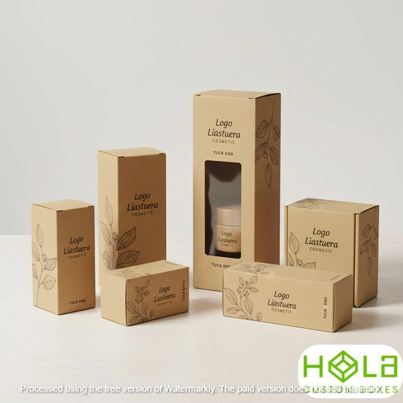
Ignoring Substrate Color: If you choose natural brown Kraft paper boxes but print light, vibrant colors on them, those colors will be muted by the brown background. If you want the colors to pop, you need to use a white base ink layer (a "flood coat") first—a step many designers forget to specify.
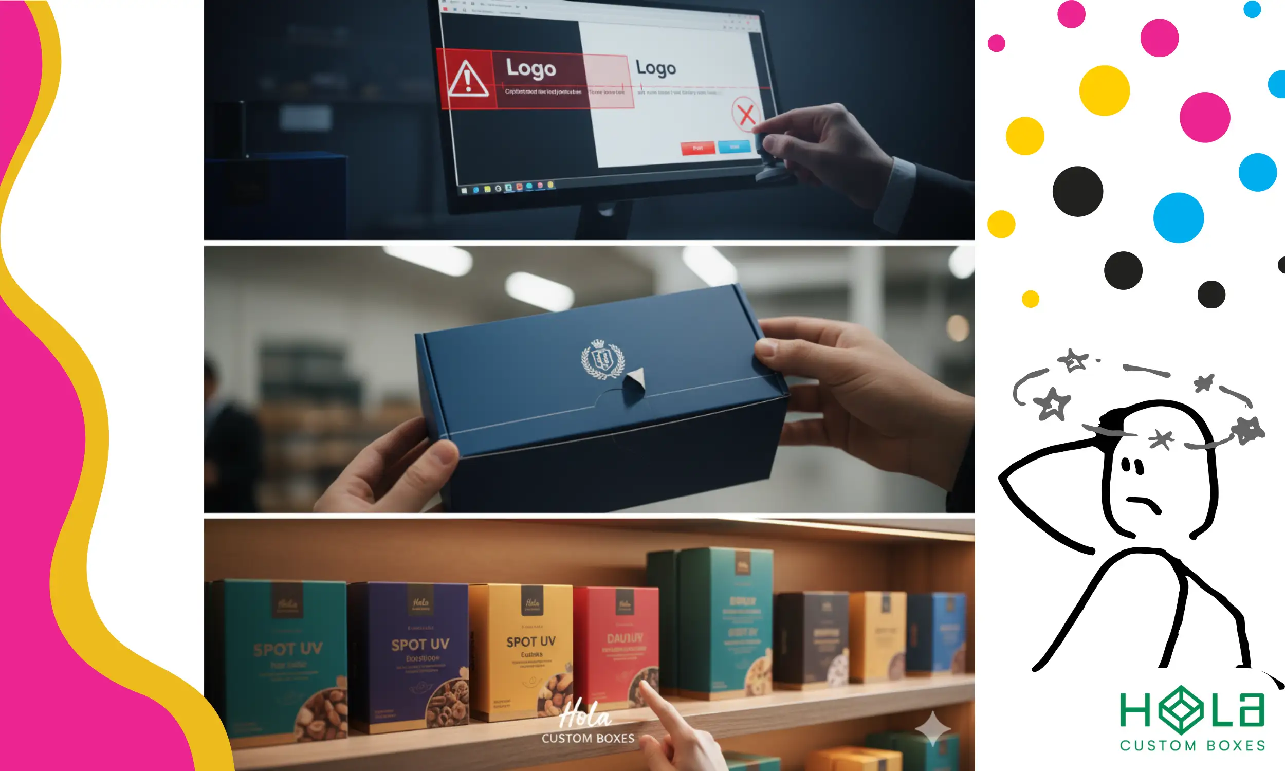
Lamination vs. Ink: Dark or heavily saturated boxes (like deep black or navy blue) are prone to showing scuff marks and fingerprints. Skipping a protective layer like matte or gloss lamination is a common mistake that leaves premium custom food packaging looking worn out before it even hits the shelf.
Foil Stamp Failures: Trying to apply intricate foil stamping or fine detail Spot UV on a highly textured or porous cardboard stock can lead to a fuzzy or broken application because the surface is too uneven. Premium finishes require smooth, high-quality stock like Solid Bleached Sulfate (SBS).
The Fix: Always select your packaging material (e.g., 18pt SBS, corrugated, eco-friendly kraft) before finalizing the artwork. Ensure the manufacturer approves the chosen finish (like Spot UV or embossing) for that specific stock to guarantee a crisp, luxury result.
Flaw #4: Neglecting Structural Integrity for Cost Savings
Cutting corners on structural elements to save a few cents per unit can lead to boxes that arrive crushed, damaged, or simply won't stay closed on the shelf. The design must be functional before it is beautiful.
The Weight and Shipping Problem
Under-Specifying Cardboard Thickness: If your product is heavy (like a set of tools or a glass candle jar), using standard 16pt cardstock will likely result in the box bulging or failing during transit. You must upgrade to 24pt board or consider E-Flute custom corrugated boxes for robust protection.
Over-Reliance on Glue: Packaging must be designed for automated packing and secure handling. Relying on weak glue tabs or non-locking structural features can lead to frequent production line stops. Designs must prioritize solid, interlocking cuts where possible.
Unboxing Experience Neglect: Many brands focus only on the exterior and ignore the customer's first interaction with the product. A poorly designed interior, whether it's an ill-fitting insert or a difficult-to-open lid, cheapens the entire brand experience.
The Fix: Provide your packaging partner with the exact weight and dimensions of your product. Test a physical prototype by packing and shipping it to verify that the structural design can withstand real-world conditions.
Partnering for Flawless Custom Packaging
Avoiding these common pitfalls requires more than just skilled design software use; it requires a partnership with a manufacturer who understands the technical nuances of industrial printing and construction.
You’ve invested time, money, and passion into your product—don't let simple design flaws undermine your brand. Our commitment at Hola Custom Boxes is to make the complex process of custom manufacturing simple and flawless. We eliminate the guesswork by offering free design support and expert pre-press checks on every order, ensuring your die-line, color specs, and structural needs are perfect before we hit print.
Ready to secure packaging that protects your budget and your brand? Visit our homepage to start your consultation today and ensure your next custom packaging run is error-free.
