5 Design Tips For Creating Eye-Catching Custom Rigid Boxes
2026-03-01 11:02:04
Are you tired of your products blending into the sea of competition? Do you want to create packaging that grabs attention and leaves a lasting impression? Look no further! In this article, we will reveal five design tips to transform your custom rigid boxes into eye-catching works of art.
Imagine a box that demands attention from across the room, with colors so vibrant they practically jump off the surface. Envision unique shapes and patterns that intrigue and captivate anyone who lays eyes on them. Picture high-quality images and graphics that tell a story and evoke emotion.
But it doesn't stop there! We'll also show you how to incorporate attention-grabbing typography to make your message pop. And why settle for ordinary when you can utilize special finishes and embellishments to add an extra touch of luxury?
By following these tips, you'll not only create packaging that stands out but also establish a consistent brand identity that customers won't forget. So get ready to elevate your product's visual appeal and leave a lasting impression with custom rigid boxes like never before!
Key Takeaways
- Eye-catching visuals and unique shapes and structures are essential for creating eye-catching custom rigid boxes.
- Vibrant colors and tactile elements can also help make the packaging stand out.
- Including the brand logo and messaging is essential for brand recognition.
- Custom rigid boxes should aim to create a memorable first impression, attract potential customers, and increase brand visibility.
The Power of Packaging Design
Once you’ve built a loyal customer base and established repeat sales, the next step is ensuring your bath bomb brand captures attention in retail spaces. Packaging plays a vital role here—it should not only reflect your brand identity but also stand out on crowded shelves. Using bold colors, creative graphics, and distinctive shapes can immediately grab attention, while clear labeling of scents, ingredients, and unique product features helps shoppers make quick and confident decisions.
Turning Packaging into a Marketing Tool

Beyond aesthetics, packaging can also serve as a marketing tool to boost credibility and trust. Highlighting customer testimonials, reviews, or brand values directly on the packaging can influence buying decisions and strengthen retailer confidence in stocking your products. By blending eye-catching design with informative and trust-building elements, your packaging becomes more than just a container—it becomes a powerful tool to maximize shelf appeal and spark retailer interest.
Incorporating Unique Shapes and Patterns
To add a touch of flair to your packaging, get imaginative by playing with unconventional shapes and mesmerizing patterns that will make your boxes pop like a burst of confetti. Explore unconventional materials such as textured papers or specialty fabrics to create a unique tactile experience for your customers. Consider incorporating interactive elements such as pull tabs, hidden compartments, or pop-up sections to surprise and engage the recipient. These unexpected features add an element of fun and intrigue to your packaging, leaving a lasting impression.
When it comes to patterns, think outside the box. Incorporate bold geometric designs or intricate motifs that reflect your brand's personality and catch the eye. Mix contrasting colors or experiment with gradients to create visual interest and depth. The key is finding the perfect balance between creativity and coherence.
Remember, each shape and pattern should enhance the overall message you want to convey through your packaging. Whether it's elegance, playfulness, or sophistication, ensure every aspect aligns seamlessly with your brand identity.
In the next section on using high-quality images and graphics, you can further elevate your custom rigid boxes by showcasing visuals that captivate viewers at first glance.
Using High-Quality Images and Graphics
By incorporating high-quality images and graphics, you can enhance your packaging's visual appeal and captivate customers with stunning visuals that leave a lasting impression. Here are three ways to make the most of this design element:
Importance of image resolution in custom rigid box design: Ensure that the images you use are of high resolution to maintain clarity and sharpness. Low-resolution images can appear pixelated and unprofessional, diminishing the overall impact of your packaging.
Enhancing visual appeal with graphic overlays: Experiment with adding patterns or textures to your images to create depth and interest. These overlays can help tie together different elements of your design and add a unique touch that sets your packaging apart.
Incorporating attention-grabbing typography: Use typography strategically to complement your high-quality images and graphics. Choose fonts that align with your brand's personality and values while ensuring readability. Consider using bold or decorative fonts for headlines or essential information to draw attention.
With these tips in mind, you can create eye-catching custom rigid boxes that visually captivate customers. In the next section about adding attention-grabbing typography, we will explore how font choices can further enhance the overall design aesthetic without overpowering it.
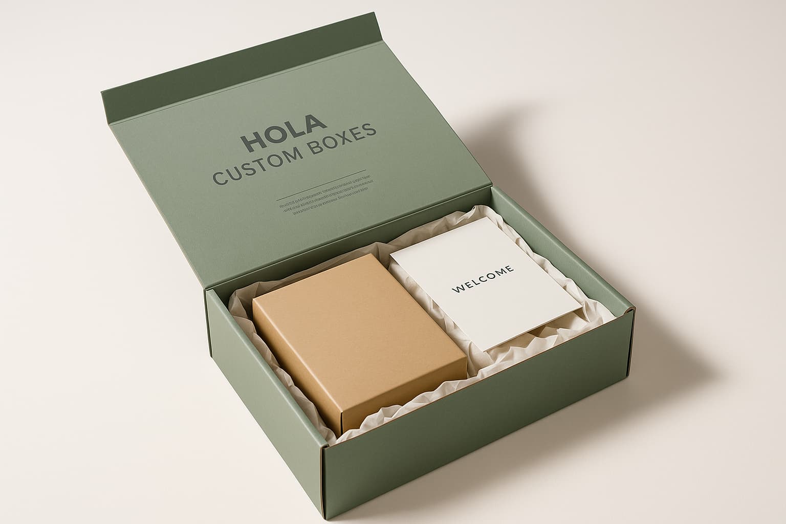
At Hola Custom Boxes, we believe packaging should be as bold and memorable as the products it protects. Our custom printed rigid boxes are designed to captivate with vibrant colors, unique shapes, and premium finishes that elevate your brand identity. By blending durability with eyecatching design, we help you create packaging that not only safeguards your products but also leaves a lasting impression, builds trust, and strengthens customer loyalty.
Adding Attention-Grabbing Typography
Incorporate attention-grabbing typography to elevate your packaging's visual impact and make it stand out in a crowded marketplace. Typography plays a crucial role in creating eye-catching custom rigid boxes that catch consumers' eyes and leave a lasting impression. To achieve this, it is essential to stay up to date on current typography trends and techniques.
One popular trend in typography is the use of bold and vibrant fonts. These fonts instantly draw attention and add personality to your packaging. Experiment with different font styles, sizes, and colors to find the perfect combination that aligns with your brand identity.
Another technique to consider is using unique typographic layouts. Instead of simply placing text in a straight line, try arranging it in interesting shapes or patterns that create visual interest. This can be achieved by adjusting letter spacing, overlapping letters, or adding decorative elements around the text.
Lastly, don't forget about the power of hierarchy in typography. Utilize different font weights and sizes to guide the consumer's eyes through essential information on your packaging.
By incorporating these typography trends and techniques into your custom rigid boxes, you can create visually stunning packaging that immediately captures attention. Transitioning to the next section on special finishes and embellishments, you can further enhance your packaging's overall design for an even more impactful result.
Utilizing Special Finishes and Embellishments
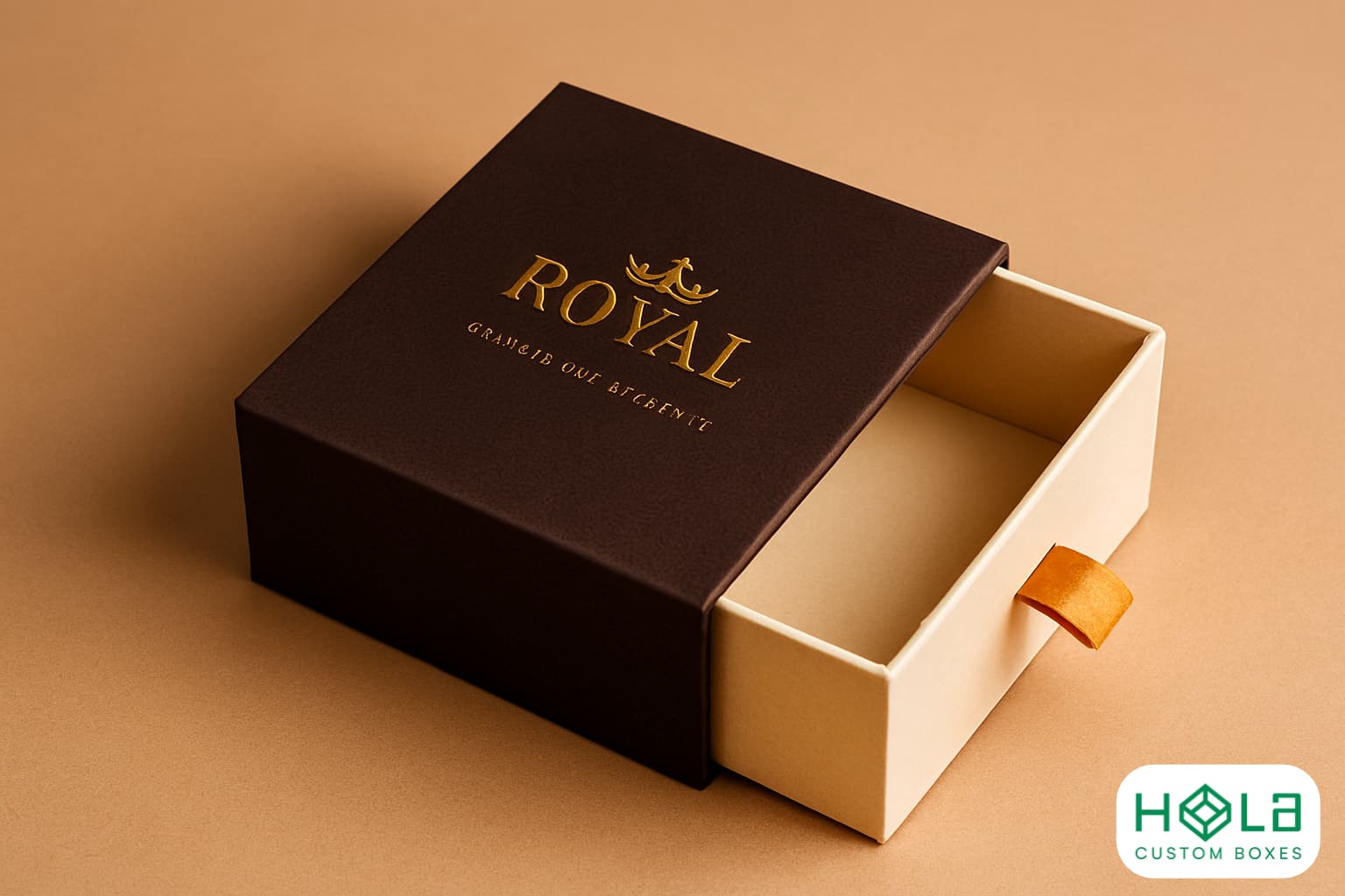
Implementing special finishes and embellishments in your packaging design elevates its sophistication and leaves a lasting impression on consumers. By using sustainable materials, you not only create an eye-catching box but also demonstrate your commitment to the environment. Consider incorporating metallic foils or spot UV coatings to add visual interest and enhance the overall look of your custom rigid boxes. These finishes can make your packaging stand out on store shelves and attract potential customers' attention.
In addition to special finishes, interactive elements can further engage consumers with your brand. Think about adding pull-out drawers, hidden compartments, or pop-up features that surprise and delight when opened. Interactive packaging creates a memorable experience for customers and increases their connection with your product.
By utilizing sustainable materials and incorporating interactive elements into your custom rigid boxes, you show that you are a brand that values both aesthetics and the environment. Creating a consistent, memorable brand identity is crucial for establishing trust with consumers. This will be explored further in the next section, where we discuss how to develop unique visuals while maintaining consistency across all branding materials.
Creating a Consistent and Memorable Brand Identity
Now that you've learned how to use special finishes and embellishments to make your custom rigid boxes stand out, let's dive into the next step: creating a consistent, memorable brand identity.
Establishing a strong brand voice is essential in today's competitive market. It allows you to connect with your target audience on a deeper level and differentiate yourself from the competition. Your brand voice should reflect your company's values, personality, and mission. By consistently using this voice across all touchpoints, from packaging to advertising, you create a sense of familiarity and trust with your customers.
In addition to establishing a strong brand voice, it's crucial to create a cohesive brand story. This involves crafting a narrative that resonates with your audience and showcases the unique aspects of your business. Whether it's through storytelling on your packaging or sharing behind-the-scenes glimpses on social media, every interaction should contribute to building this story.
By incorporating these strategies into your custom rigid box design, you can create an eye-catching package that not only captures attention but also leaves a lasting impression. So go ahead, unleash your creativity, and let your brand shine through!
At Hola Custom Boxes, we believe packaging should be as bold and memorable as the products it protects. Our custom printed rigid boxes are designed to captivate with vibrant colors, unique shapes, and premium finishes that elevate your brand identity. By blending durability with eyecatching design, we help you create packaging that not only safeguards your products but also leaves a lasting impression, builds trust, and strengthens customer loyalty.
