10 Best Color Printing Combinations to Choose for Custom Matchbooks
2025-08-04 17:34:08.jpg)
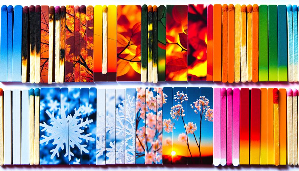
Selecting the best color combinations for custom matchbooks elevates your branding. Consider vibrant pairings like Yellow and Charcoal for attention, or Pink and Cherry Red to appeal to youthful audiences. Sophisticated options include Black and Gold for a luxurious feel, and Silver with Navy Blue for a refined look. For a modern twist, Off-White and Sage Green offers elegance, while Green and Gold radiates harmony. In warmer combinations, Teal and Coral spark playfulness, and Burnt Orange paired with Peach Fuzz evokes energy. Each combination tells a story that resonates; discover how to make your matchbooks unforgettable.
Main Points
- Yellow and Charcoal create a striking contrast, enhancing visibility and promoting brand recognition with a blend of optimism and sophistication.
- Pink and Cherry Red appeal to youthful audiences, establishing joyful connections, ideal for memorable event marketing.
- Off-White and Cherry Red provide a nostalgic yet modern contrast, enhancing visibility and energy for broad appeal.
- Black and Gold communicate luxury and exclusivity, with gold accents elevating the perceived quality of matchbook designs.
- Teal and Coral evoke a playful, tropical vibe, enhancing visibility while appealing to modern and vibrant brand identities.
Yellow and Charcoal
Regarding creating impactful custom matchbooks, the color combination of yellow and charcoal stands out as a top choice for brands seeking to captivate their audience. This striking duo creates a vibrant visual impact, where the bright yellow draws the eye and charcoal provides a sophisticated backdrop. Together, they enhance the overall appeal of the design, ensuring that promotional materials do not get lost in the clutter of crowded marketplaces.
Custom packaging enhances brand visibility through its unique designs, making this combination not only visually appealing but also strategically effective.
Yellow, with its energetic and optimistic connotations, effectively grabs attention, while charcoal acts as a neutral anchor, allowing intricate details to shine. This balance is particularly beneficial for brands aiming for a modern aesthetic, as it promotes brand recognition through memorable visuals.
Utilizing yellow and charcoal on matchbooks not only differentiates a brand's promotional materials but also engages customers on an emotional level. The combination evokes feelings of optimism and sophistication, appealing to a diverse audience across various marketing contexts.
In a world where first impressions matter, this color scheme offers an effective strategy for brands to stand out and leave a lasting impression.
Pink and Cherry Red
The enchanting blend of pink and cherry red infuses custom matchbooks with a lively and inviting spirit, perfectly suited for brands targeting a youthful and energetic audience.
This fascinating color combination evokes feelings of warmth and friendliness, establishing a positive emotional connection that resonates with consumers. When executed thoughtfully, the integration of pink and cherry red can enhance brand recognition through striking visuals that linger in the minds of potential customers.
Utilizing this vibrant palette aligns with strategic color selection critical for attracting consumers and can greatly influence purchasing decisions.
Consider the following advantages of using pink and cherry red in your matchbook designs:
- Playful Branding: This vibrant combination embodies a fun and spirited identity.
- Emotional Resonance: The colors work together to create a sense of warmth and approachability.
- Visual Impact: The vividness of cherry red contrasts beautifully with the softer pink, ensuring designs stand out.
- Seasonal Appeal: Ideal for events or promotions that celebrate joy and liveliness, attracting a broad demographic.
Incorporating this dynamic duo into your custom matchbooks can transform them into memorable marketing tools that effectively engage and charm your audience.
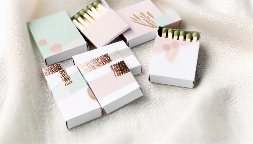
Off-White and Sage Green
A serene palette of off-white and sage green brings an air of sophistication to custom matchbooks, making them a compelling choice for brands that value elegance and modernity. Off-white serves as a versatile base color, seamlessly integrating with various design elements while providing a clean, fresh canvas. This neutrality allows brands to showcase their unique logos and messages without distraction.
By incorporating eco-friendly materials, such as recycled paper, brands can further enhance their commitment to sustainability, resonating with environmentally conscious consumers.
Sage green injects a natural, calming touch, appealing to eco-conscious consumers and aligning perfectly with themes of wellness and relaxation. This color combination not only evokes feelings of tranquility but also enhances customer engagement by fostering a deeper connection to nature.
The understated elegance of off-white and sage green creates a sophisticated aesthetic that stands out in retail settings. Moreover, the subtle contrast between these hues enhances visibility, ensuring that custom matchbooks capture attention while promoting eco-friendly designs.
As brands aim for modern elegance, this color duo emerges as an ideal choice, embodying both style and sustainability. In a world increasingly focused on environmental consciousness, off-white and sage green resonate powerfully, making them an effective combination for brands looking to leave a lasting impression.
Black and Gold
Elevating the conversation from the serene off-white and sage green palette, the striking combination of black and gold introduces a bold sense of luxury and exclusivity to custom matchbooks.
This color pairing harnesses the principles of color psychology, with black serving as a versatile base that accentuates gold's shimmering allure. Together, they create a design that resonates with high-end brands, making it an ideal choice for upscale events.
The allure of black and gold lies in its ability to communicate sophistication, making it particularly effective in the custom matchbook market.
Consider the following advantages:
- Luxury Branding: The pairing conveys opulence, appealing to discerning customers.
- Visual Impact: Gold foil detailing captures attention and leaves a lasting impression.
- Versatility: Black's adaptability allows it to complement various brand aesthetics.
- Quality Association: This color scheme is synonymous with refinement, elevating the perceived value of products.
Incorporating black and gold into matchbook designs is not just a creative choice; it is a strategic move that enhances brand identity and sets the stage for memorable experiences.
A Striking Blend of Vintage and Modern Appeal
The combination of off-white and cherry red in custom matchbooks creates a visually captivating contrast that effortlessly blends nostalgic charm with contemporary style. Off-white provides a soft, neutral backdrop that allows the bold cherry red accents to stand out, making it an ideal palette for brands seeking a timeless yet modern aesthetic. This pairing captures attention instantly, evoking a sense of warmth and familiarity that resonates with a wide audience.
Enhancing Brand Recognition Through Color Impact
Cherry red adds energy and vibrancy to the design, making it perfect for seasonal promotions, events, or retail displays. Its visual intensity boosts visibility, while the overall color pairing strengthens emotional connection with customers. Off-white and cherry red matchbooks not only elevate your packaging but also leave a lasting impression, helping your brand remain memorable and easily recognizable in a crowded marketplace.
Burnt Orange and Peach Fuzz
While the nostalgic charm of off-white and cherry red creates a striking visual appeal, burnt orange and peach fuzz introduce a fresh, vibrant energy perfect for contemporary designs.
This lively color combination not only aligns with the Pantone Color of the Year 2024 but also captivates a modern audience seeking innovation and uniqueness.
Ideal for seasonal promotions and summer-themed campaigns, burnt orange and peach fuzz evoke warmth and invite engagement. The contrast between these hues effectively captures attention, making it a strategic choice in competitive retail environments.
Consider the following benefits of utilizing this color pairing in custom matchbooks:
- Enhanced Brand Visibility: The warmth of burnt orange and the softness of peach fuzz stand out, increasing recognition.
- Positive Color Psychology: These colors elicit feelings of cheerfulness and freshness, aligning with the spirit of summer.
- Versatile Applications: Suitable for various promotional items, they can complement a diverse range of themes.
- High-Quality Impact: When printed on premium materials, this combination elevates the overall aesthetic and perceived value.
Incorporating burnt orange and peach fuzz into your design strategy can rejuvenate your promotional efforts, ensuring they resonate with your target audience.
Silver and Navy Blue
The striking contrast of silver and navy blue creates a refined visual experience, perfectly suited for brands that aspire to convey sophistication and professionalism. This compelling pairing offers a modern aesthetic, where navy blue serves as a strong base, enhancing depth and providing a rich backdrop for silver detailing.
The use of silver, whether in foil or matte finishes, elevates the overall design, adding an unmistakable touch of luxury branding.
From a color psychology perspective, the deep navy evokes stability and trust, while the reflective silver introduces an element of refinement. This combination appeals to discerning customers seeking reliable and sophisticated brands, making it particularly popular in industries such as finance, law, and high-end retail.
The elegance of silver and navy blue not only stands out but also guarantees that your custom matchbooks leave a memorable impression. This color duo effectively communicates a strong message of professionalism and elegance, positioning businesses as leaders in their fields.
Silver and navy blue create an enticing visual narrative that resonates deeply with audiences, enhancing brand perception and fostering loyalty.
Green and Gold
A mesmerizing palette of green and gold radiates luxury and sophistication, making it an exceptional choice for brands enthusiastic to embody elegance. This color combination is especially compelling for those aiming for eco-friendly branding, as green symbolizes growth, freshness, and harmony.
When paired with the opulence of gold, it attracts eco-conscious customers while providing a rich visual experience.
Utilizing green and gold in custom matchbooks enhances your marketing strategy, particularly for seasonal promotions. Here are some key benefits:
- Luxurious Appeal: Gold accents elevate the design, guaranteeing it stands out.
- High Visibility: The contrast between green and gold creates memorable marketing materials.
- Festive Atmosphere: Ideal for holiday promotions, evoking warmth and celebration.
- Eco-Conscious Attraction: Appeals to consumers who value sustainability in their purchases.
Incorporating this elegant color scheme not only enhances the aesthetic but also strengthens your brand's message, making it a formidable choice in a competitive marketplace.
The synergy of green and gold guarantees your custom matchbooks leave a lasting impression.
Teal and Coral
With a vibrant interplay of teal and coral, this color combination embodies the essence of summer and tropical bliss, making it an enchanting choice for custom matchbooks. Teal, reminiscent of serene ocean waves, pairs beautifully with coral's warm, sun-kissed hues, creating an invigorating and lively aesthetic perfect for beach-themed events or summer promotions.
This striking pairing not only evokes feelings of balance and harmony but also captivates customers seeking vibrant aesthetics that resonate with youthful energy. The contrast between the coolness of teal and the warmth of coral enhances visibility, ensuring that matchbook designs stand out in crowded marketplaces.
A white or off-white background can amplify the brightness of these colors, allowing them to pop and attract attention.
Incorporating teal and coral into matchbook designs fosters a playful and inviting brand image, making it an ideal choice for businesses aiming to connect with an energetic audience. Whether used for a summer wedding, a beach party, or a tropical-themed event, this color combination will certainly leave a lasting impression, capturing the spirit of fun and excitement.
Embrace the vibrancy of teal and coral for unforgettable custom matchbooks.
Red and White
Bold and striking, the combination of red and white commands attention and evokes a sense of energy and excitement. This dynamic pairing is not just visually appealing; it carries profound significance in branding and marketing strategies.
Red, often associated with passion and action, aligns with red symbolism that speaks to strong emotions and liveliness. The psychological impact of red can stimulate appetite, making it particularly effective for food-related businesses.
When considering red and white for custom matchbooks, take note of the following advantages:
- High Readability: The stark contrast guarantees that text and logos are easily legible.
- Versatile Appeal: This duo works well across various branding themes, from casual to sophisticated.
- Consumer Recognition: Brands like Coca-Cola and Target demonstrate the effectiveness of this combination in enhancing brand recall.
- Energy and Excitement: The vibrant energy of red captures attention, ideal for crowded environments.
Utilizing red and white in custom matchbooks not only amplifies brand visibility but also leverages the powerful psychology of color to leave a lasting impression on potential customers.
Conclusion
In selecting color combinations for custom matchbooks, the interplay of hues such as Yellow and Charcoal or Black and Gold enhances aesthetic appeal. Each pairing, from Teal and Coral to Off-White and Sage Green, evokes distinct emotions and associations, contributing to effective branding. The strategic use of color not only attracts attention but also communicates brand identity. Ultimately, the right choice of colors can transform a simple matchbook into an enchanting marketing tool, leaving a lasting impression.