How To Choose The Right Colour Scheme For Custom Rigid Gift Packaging Boxes
2026-01-02 16:48:32.jpg)
Are you struggling to choose the perfect color scheme for your custom rigid gift packaging boxes? With so many options available, deciding on the right colors that will represent your brand or suit the occasion can be overwhelming. But fear not, as we have compiled a guide to help you navigate this process.
Firstly, it's important to understand the occasion and theme of your packaging. Are you creating gift boxes for a festive holiday or a corporate event? Is there a specific theme that needs to be reflected in the design? Considering these factors, you can narrow your color choices and create a cohesive look appropriate for the occasion. Keep reading for more tips on choosing the color scheme for your custom rigid gift packaging boxes.
Key Takeaways
- Consider the occasion, theme, cultural context, and personal preferences when choosing color schemes for custom rigid gift packaging boxes.
- Use personalization options and market research to create a unique design incorporating branding and logo colors for recognition and professionalism.
- Experiment with different color combinations, mixing bold hues with softer pastels or unexpected pairings to create a cohesive and visually appealing color scheme that aligns with brand values.
- Incorporate color psychology to create an emotional connection with customers and research cultural connotations of colors to ensure that the colors chosen align with the brand's message and values.
Understanding the Occasion and Theme
If you're wondering how to choose the perfect color scheme for your custom rigid gift packaging boxes, understanding the occasion and theme is key! Event relevance plays a vital role in determining which colors will work best. For instance, if it's a wedding, soft pastels or white would work beautifully, while bold reds or blacks would be more appropriate for corporate events.
Cultural context is also essential to consider when deciding on a color scheme. Different cultures attach different meanings to colors; hence it's crucial to get familiar with the culture of the event you're planning for. For example, in Western cultures, white signifies purity and innocence and is often used during weddings. However, in Chinese culture, white represents mourning and death and is, therefore, unsuitable for celebrations.
Considering the recipient's preferences is equally important when choosing a color scheme. Knowing their favorite colors or what they find visually appealing can help you create custom rigid gift packaging boxes that truly resonate with them. Before settling on a color palette, take some time to research their likes and dislikes so you can craft something unique that captures their personality perfectly!
Tailoring Gift Packaging to Personal Tastes
In custom gift packaging, aligning the design with the recipient’s personal style can transform a simple box into a meaningful and memorable experience. Personalization is key—whether you’re catering to someone who loves vintage aesthetics with muted tones like brown or sepia, or to someone who prefers bold, modern styles with vibrant colors like hot pink or lime green. Thoughtfully chosen colors and design elements show that you’ve considered the recipient’s individuality, adding emotional value to the gift.
Using Market Trends to Inform Design Choices
In addition to personal preferences, market research plays a crucial role in selecting color schemes and packaging styles. Understanding current industry trends ensures your packaging is not only personalized but also visually relevant and appealing. This strategic approach helps your gift packaging stand out, appealing to both the recipient and broader audiences. Combining personalization with trend awareness allows you to create stunning, customized gift boxes that leave a lasting impression.
Choosing Complementary Colors
Creating a visually stunning custom gift package that reflects the recipient's taste requires careful consideration of complementary colors. When choosing colors, it's essential to think about contrast versus harmony. Do you want the colors to pop against each other or blend seamlessly together? Contrasting colors can create an exciting, dynamic look, while harmonious colors can provide a soothing effect.
Another factor to consider is warm versus cool tones. Warm tones such as reds, oranges, and yellows tend to evoke feelings of excitement and energy. Cool tones such as blues, greens, and purples have a calming effect on viewers. Depending on the occasion and the recipient's personality, you may want to choose warm or cool tones for your gift packaging.
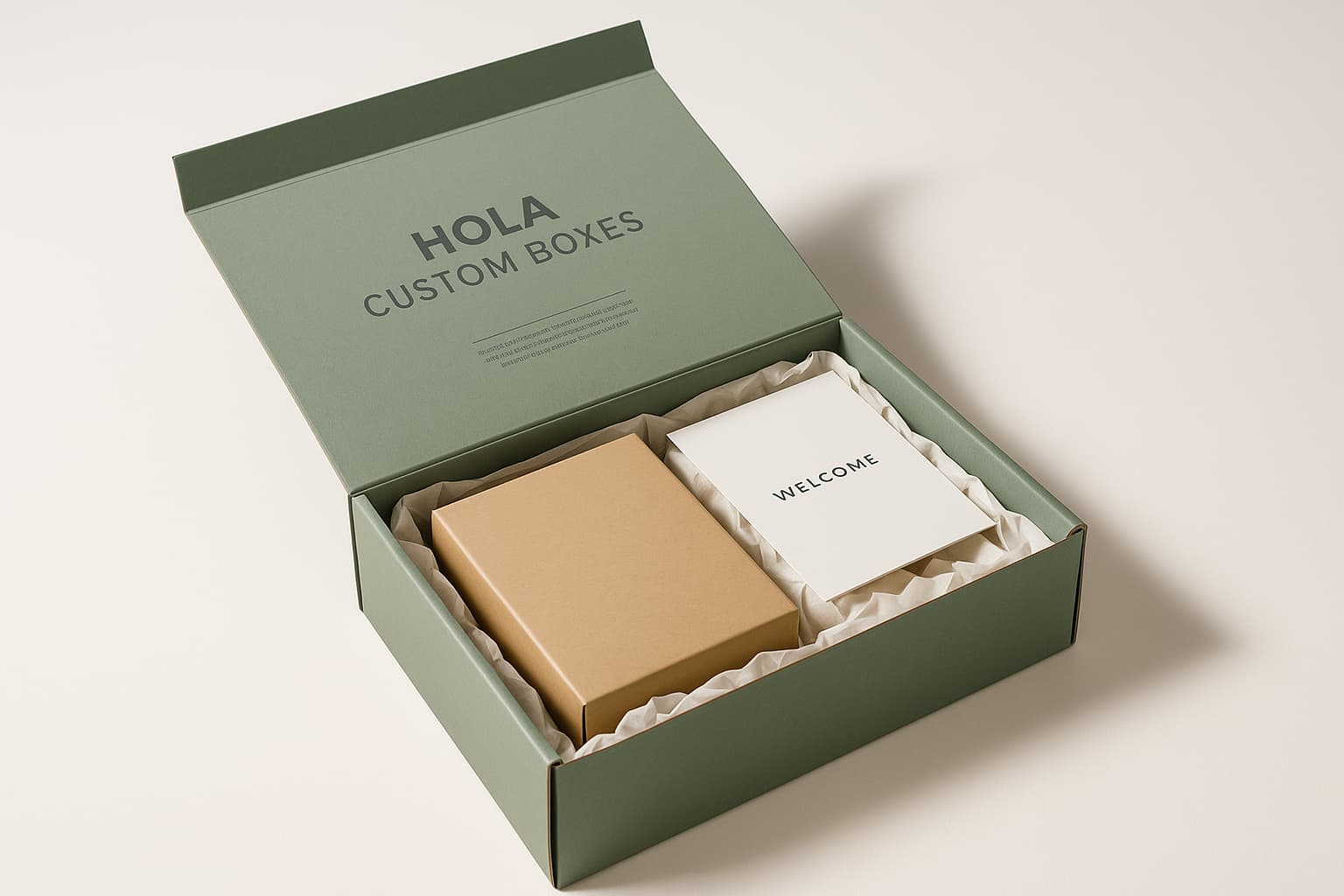
Once you've chosen your complementary color scheme based on contrast vs. harmony and warm vs. cool tones, consider branding and logo colors if applicable. Incorporating these elements into your gift packaging can add a professional touch while reinforcing the recipient's brand recognition. By carefully considering all these factors when choosing your color scheme, you can create custom rigid gift packaging boxes that genuinely stand out in both appearance and functionality.
Thinking about Branding and Logo Colors
Incorporating your brand's logo colors can add a touch of professionalism and reinforce brand recognition. When choosing the color scheme for your custom rigid gift packaging boxes, it's essential to consider how your branding affects the overall appearance. Using the same colors as your logo creates a cohesive look that will leave a lasting impression on the recipient.
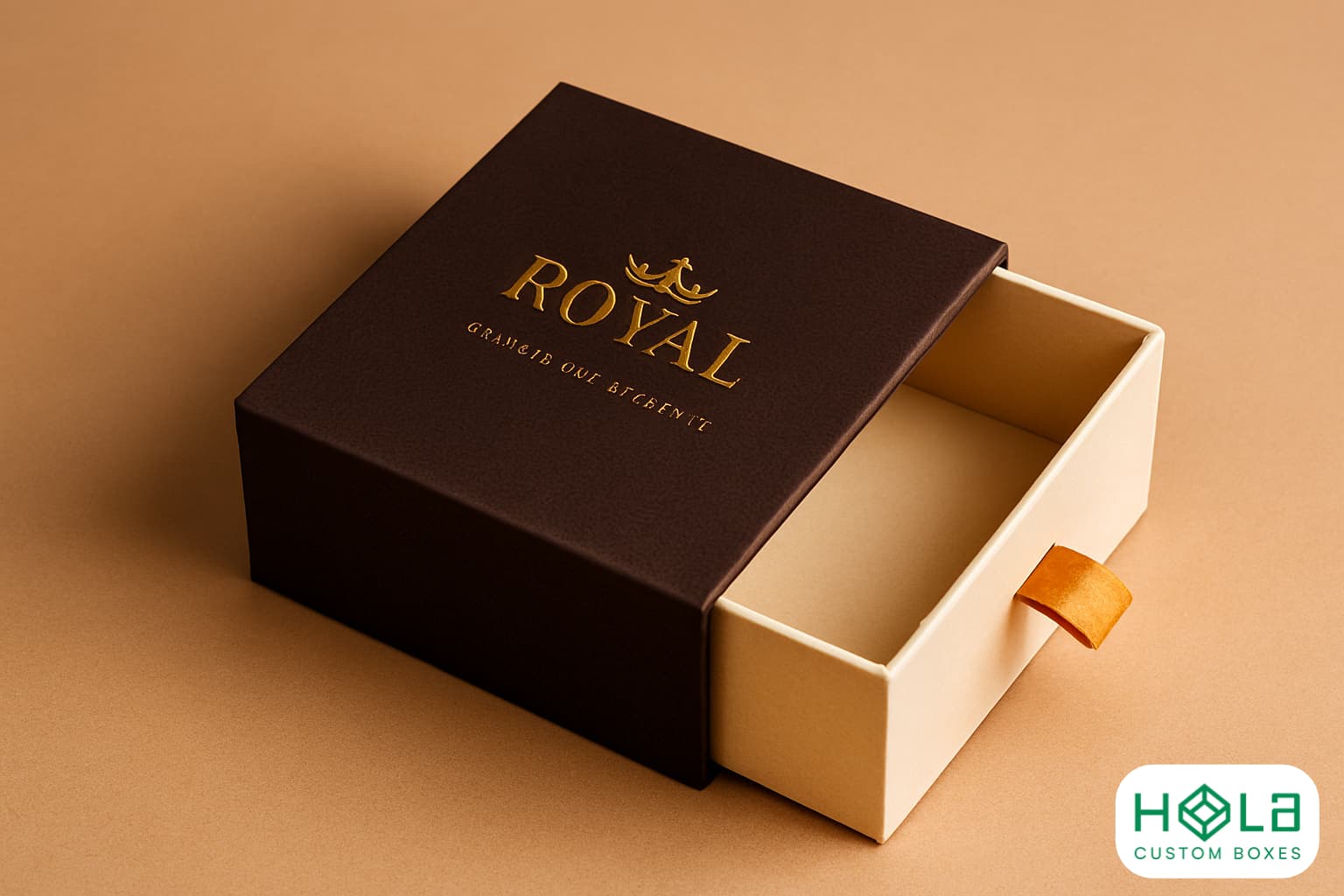
Color psychology is essential in creating an emotional response to your gift packaging. Different colors evoke different emotions and associations, and by incorporating these into your design, you can make a deeper connection with your audience. For example, deep shades of blue or purple can convey elegance and sophistication if you're selling luxury goods or high-end products. On the other hand, bright colors like yellow or orange might be more appropriate for fun and playful gifts.
Brand loyalty is another important factor when choosing a color scheme for your custom rigid gift packaging boxes. By incorporating consistent branding across all aspects of your business, including packaging design, you'll establish trust with customers and reinforce their loyalty to your brand over time. This creates long-term value for you and your customers while building enduring relationships beyond just one purchase.
When incorporating color psychology into your design strategy for custom rigid gift packaging boxes, it's important to remember that each shade has unique properties that can either enhance or detract from the overall effect. Be sure to experiment with different combinations until you find the perfect balance between aesthetic appeal and emotional resonance – without sacrificing functionality or durability!
Incorporating Color Psychology
Get ready to evoke emotions and make a lasting impression with your gift packaging by incorporating color psychology into your design strategy! Color symbolism can significantly shape how people perceive your brand and message. For example, warm colors like red and orange convey excitement, passion, and urgency. Meanwhile, cool colors like blue and green can represent calmness, trustworthiness, and growth.
It's important to consider cultural influence when choosing a color scheme. Different cultures may interpret specific colors differently. For instance, in Western culture, white is often associated with purity or innocence; in Eastern culture, it symbolizes mourning or death. Research the cultural connotations of different colors before finalizing your design.
Incorporating color psychology into your custom rigid gift packaging boxes can help you effectively communicate your brand values and create an emotional connection with customers. Now that you better understand how color can influence perception, it's time to experiment with different color combinations and find the perfect palette for your packaging design.
Experimenting with Different Color Combinations
Now that you've better understood how color symbolism can impact perception, it's time to play around with different color combos and see which ones really pop. To start, take a look at current color trends and popular palettes. This will give you an idea of what colors are popular and how they work together in the design world.
When experimenting with different color combinations, remember to keep your brand's identity and target audience in mind. Colors can evoke emotions and convey messages, so choosing colors that align with your brand values and resonate with your customer base is essential. For example, if your brand is known for eco-friendliness, consider using earthy tones or shades of green in your packaging design.
Don't be afraid to get creative with your color choices! Mix bold hues with softer pastels, or try unexpected pairings like pink and orange. Just make sure the overall scheme is cohesive and visually appealing. By experimenting with different color combos and finding the perfect palette for your custom rigid gift packaging boxes, you'll create a memorable unboxing experience for your customers that perfectly represents your brand.
Conclusion
Congratulations! You've made it through choosing the perfect color scheme for your custom boxes. By following these simple steps, you can be confident that your gift boxes will be a hit with whoever receives them.
Remember to consider the occasion, theme, and the recipient's personal preferences. Think about complementary colors and how they can enhance your design. Don't forget branding and logo colors that represent your company's identity. And lastly, incorporate color psychology to create an emotional connection with your customers.
You'll find what works best for your gift box design by experimenting with different color combinations. Whether you're going for a bold or subtle look, ensure it accurately represents your brand and leaves a lasting impression on those who receive it. So go ahead and add some color to your gift-giving experience!
At Hola Custom Boxes, we bring creativity and precision together to craft packaging that elevates your brand. Our custom printed rigid boxes are designed to reflect your identity with striking color schemes, premium materials, and thoughtful details that leave a lasting impression. Whether for corporate gifting, retail presentation, or luxury products, these boxes transform ordinary packaging into a powerful branding tool. By combining durability with elegance, we help businesses showcase professionalism, build recognition, and create memorable unboxing experiences that foster trust and loyalty.