Designing a minimalistic look for your pillar candle packaging
2025-12-31 20:24:29
Designing A Minimalistic Look For Your Pillar Candle Packaging
As a packaging design specialist, Hola Custom Boxes knows how important it is to create the perfect look for your product. When designing minimalist packaging for pillar candles, there are many considerations to keep in mind. In this article, I'll share tips and tricks for crafting an aesthetically pleasing package that highlights the product inside.
Minimalism has become increasingly popular in recent years due to its ability to create a clean, modern appearance. You can quickly achieve a minimalist look for your pillar candle packaging with a few key elements. Simplicity is critical when making these types of custom packaging, as it emphasizes the candle's beauty.
The right colors, shapes, and materials must be considered when designing minimalist pillar candle packaging. Following these tips ensures your package successfully conveys its contents while staying true to the minimalist aesthetic. With the proper guidance, you can create an eye-catching package that stands out from the competition!

Definition Of Minimalism
Minimalism is a design style that embraces simplicity and functionality. Clean lines, geometric shapes, neutral colors, and negative space characterize it. The goal of minimalist design is to be visually appealing while eliminating clutter. Minimalistic styling conveys sophistication, elegance, and modernity.
When designing pillar candle packaging with a minimalistic look, focusing on the product and its features is essential. This means using a minimalist approach that emphasizes the product's details without being too busy or overwhelming. A simple background color or pattern can draw attention to the candle and create an atmosphere of calmness or sophistication. Using light colors such as white, gray, or pastels is also effective for creating a minimalistic look that stands out from the competition.
Present a clean, premium feel with Custom Candle Wax Boxes that protect and highlight pillar form.s
Reasons To Choose A Minimalistic Look For Your Pillar Candle Packaging
Now that we have defined minimalism, it is time to understand why a minimalistic look can benefit your pillar candle packaging. A minimalistic appeal is one of the most apparent reasons for this style. It helps create an emotional connection with customers by creating an immediate impact. This design also allows you to focus on a single central element of the package, such as your logo or product name. This can help draw attention and emphasize what matters, making your packaging stand out.
In addition to its visual appeal, going minimalistic is also cost-effective. You can save money by using fewer materials and simpler printing techniques when creating a simpler design. Furthermore, it is more eco-friendly than excessive packaging materials as less will be used overall. A minimalist look helps reduce waste while still offering an attractive, modern aesthetic.
By focusing on the essentials and eliminating unnecessary elements, you can create a visually appealing, cost-effective package that stands out in the market while appealing to environmentally conscious customers. In other words, a minimalist approach can deliver maximum impact at minimal cost – making it an excellent choice for your pillar candle packaging design!
Elevate unboxing with understated structures like Custom Printed Rigid Boxes
Selecting The Right Materials And Colors
When selecting the right materials for your pillar candle packaging, consider aesthetics and functionality. It's a good idea to use lightweight, easy-to-fold and assemble materials, as well as long-lasting materials that can withstand wear and tear. This will ensure your packaging looks great for a long time.
Regarding color theory, neutral tones work best for a minimalistic design. A combination of white, brown, and black will create a sleek look that will impact your consumers. Consider adding subtle color accents, such as gold or silver foil printing, to draw attention without overdoing it. These small details add a luxurious touch while keeping the overall design minimalistic.
The material selection and color theory you choose should be carefully considered when designing your pillar candle packaging to create an aesthetically pleasing yet functional design. You can create a stunning package with the right combination of these elements.
Shape And Size Considerations
Packaging, shape, and size considerations are of utmost importance when designing a minimalistic look for a pillar candle. The packaging should be simple yet aesthetically pleasing, and it should also highlight the product inside. Opt for rectangular or cuboid shapes, which can fit into tight spaces. Additionally, ensure the box opens and closes easily to protect the product from damage during transport and storage.
In terms of size, consider both the product's dimensions and its weight. Generally, choosing more robust packaging to better protect your product during transit or storage is best. You'll also want to ensure there is enough space between the package's sides and your product's edges so it won't get damaged in transit or when customers handle it. Be mindful of how much material you're using, too, as this will affect costs and environmental impact—choose sustainable materials wherever possible.
Visual Guidelines For Designers
Designers should focus on creating minimalist pillar candle packaging. The key visual elements to include are typography, imagery, and color. It's essential to keep the design balanced and straightforward by avoiding unnecessary details.
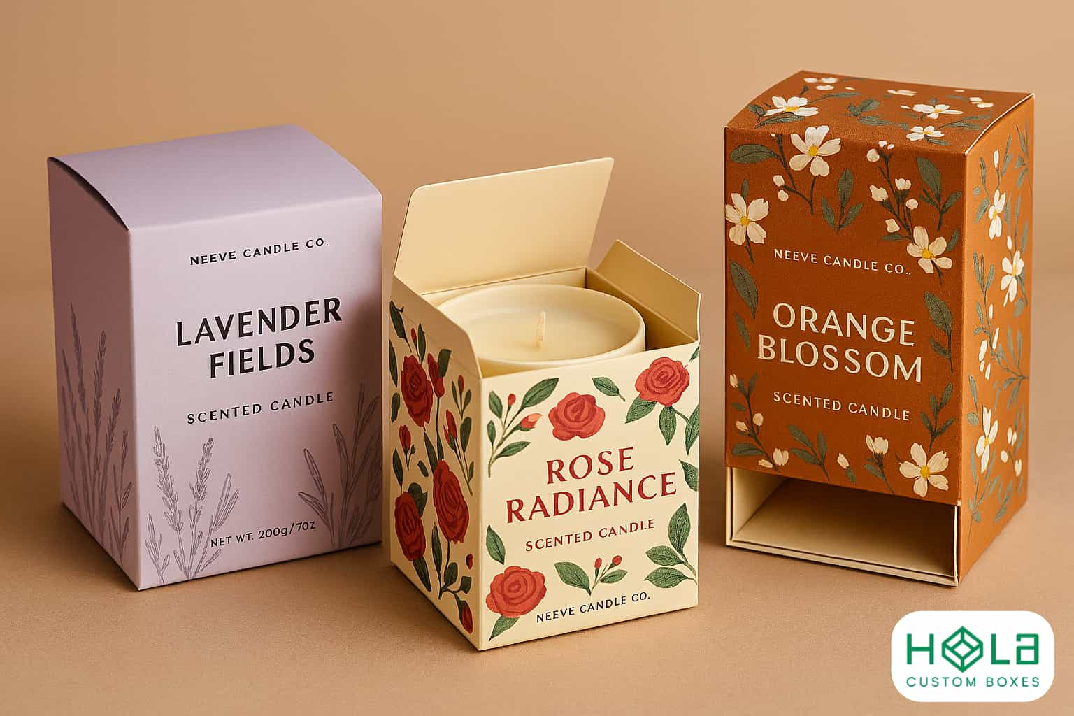
Designers should use fonts that are easy to read and match the overall aesthetic of the packaging. They should also consider using illustrations or photography to create an eye-catching effect. Color can also be combined with type and imagery to add interest. However, sticking to a limited palette is essential to maintain a clean look. When combining different design elements, designers should ensure they complement each other and create harmony within the package design.
By following these visual guidelines, designers can create an attractive yet minimalistic look for their pillar candle packaging.
Keep materials responsible through Eco-Friendly Boxes
Creative Ideas For Minimalistic Pillar Candle Packaging
When designing a minimalist look for pillar candle packaging, it's essential to consider a design that stands out from competitors. The goal is to create a product that looks luxurious and modern without being too flashy or cluttered. An innovative approach to packaging design can help you achieve this goal.
Consider using materials with unique textures and colors that will draw the eye of potential customers. Natural materials such as wood, stone, or marble can add an elegant touch to your packaging design. You can also use matte finishes on your packaging to give it a more sophisticated look. For example, matte black boxes with gold foil accents will make your product stand out. Additionally, choose fonts and graphics that are bold yet minimalist to make your product appear more contemporary.
By using these creative ideas, you'll achieve a minimalist, modern, and luxurious look for your custom candle packaging. By thoughtfully considering materials and designs, you can craft an eye-catching product that appeals to customers who appreciate minimalism and style.
For seasonal displays, stage sets using Display Packaging that maintain your minimal aesthetic.
Conclusion
Designing minimalistic pillar candle packaging is challenging, but it doesn't have to be. Following the guidelines outlined in this article, you can create an eye-catching design that stands out from the crowd.
The right materials, colors, and shapes all play a role in creating a successful design. The right combination of elements is key to achieving the perfect minimalistic look. Additionally, taking the time to consider visual guidelines and creative ideas will help you create something exceptional.
With these tips, anyone can create an attractive, minimalistic pillar candle packaging design. With simple steps and creativity, your next project will impress customers and stand out on store shelves.
